www.azhome.co
Design Review 8
Things to Learn
Applying design principles while creating a layout.
Using dark, bold colours in the foreground.
The Layout
Natural Light
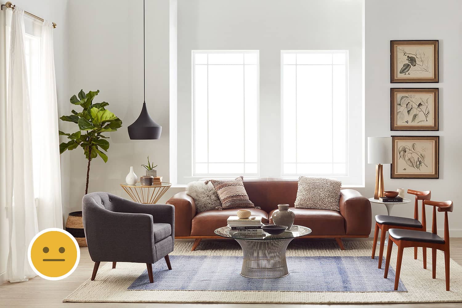
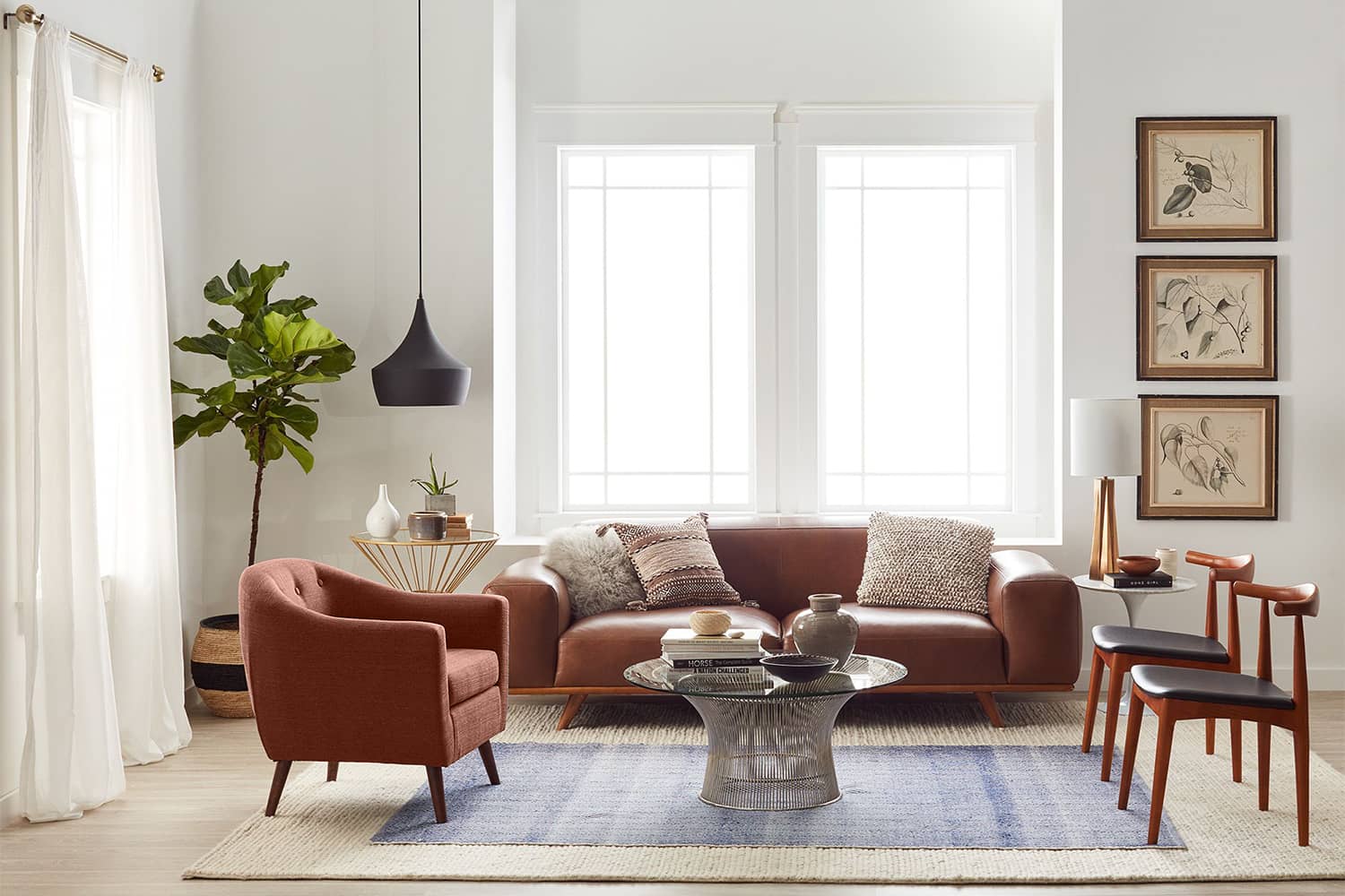
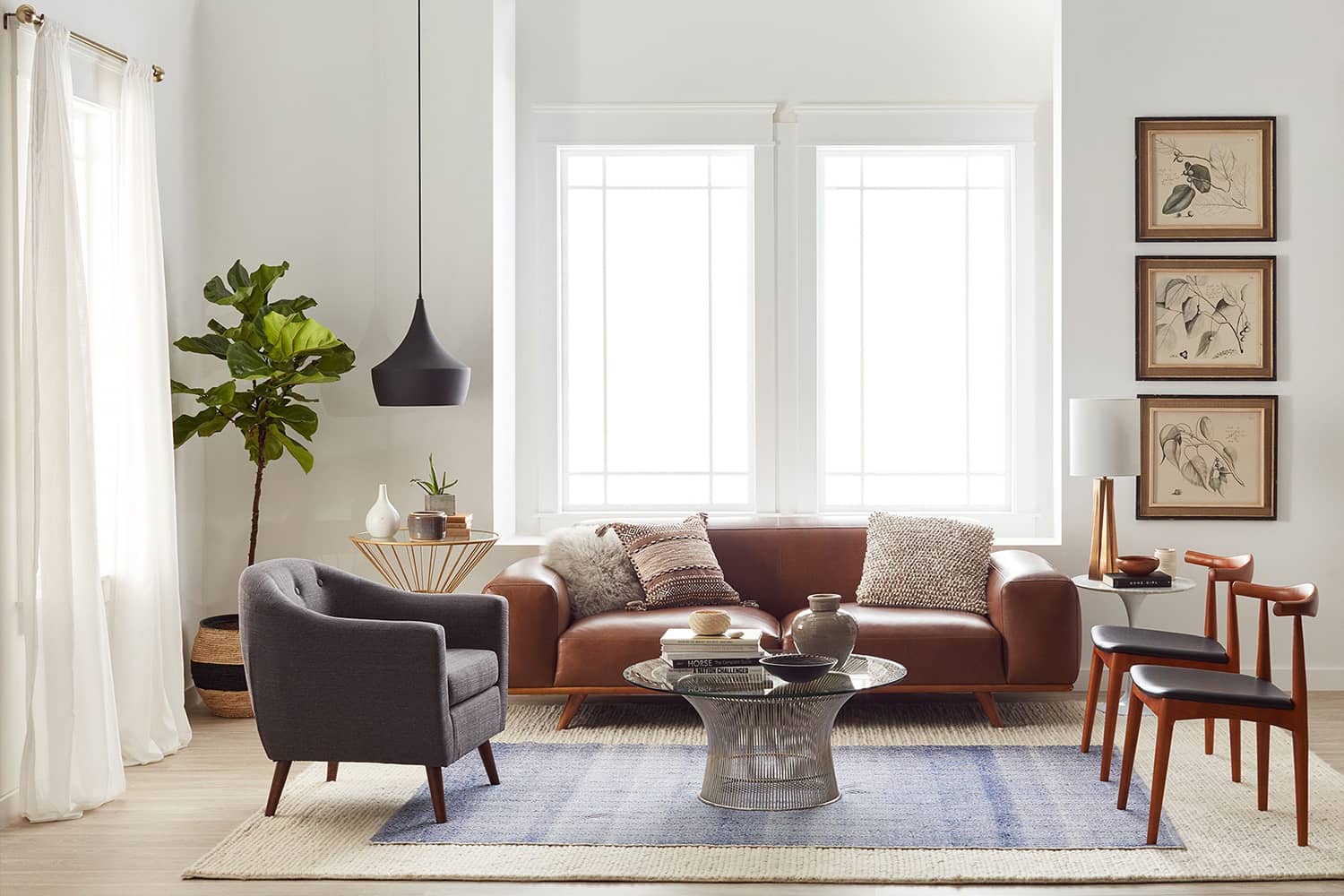
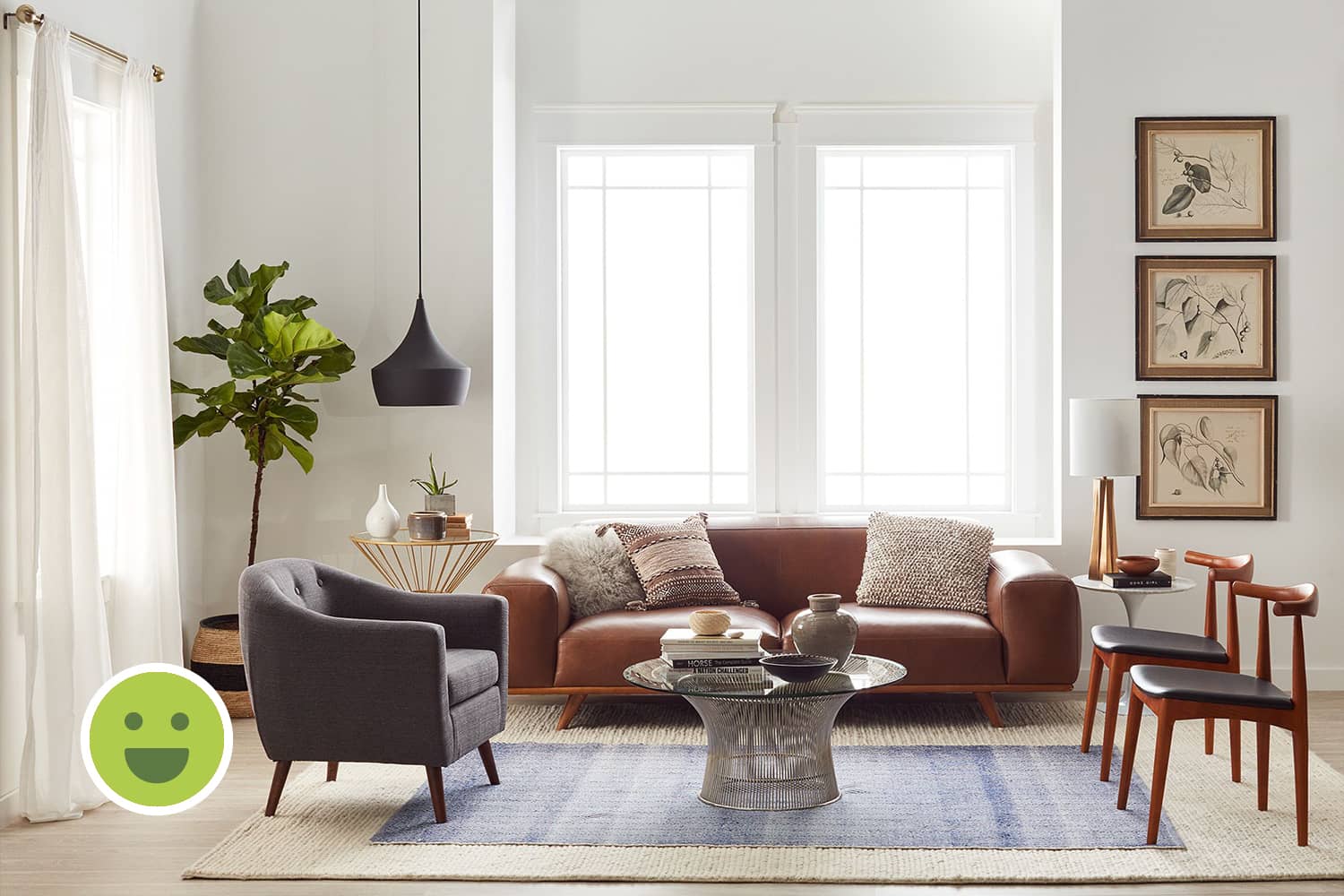
There is ample natural light due to the uncovered window in the center and the opening to the left covered by curtains. This is the easiest way of making any space feel lively and bright. It also allows for a wider colour palette to be used in the space.
U-shaped Seating
U-shaped seating is most efficient as it maximizes the number of seats with the right orientation while improving the right orientation for interaction without affecting its function.
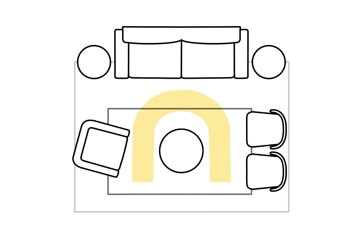
A U-shaped seating layout as seen in this case.
Alignment
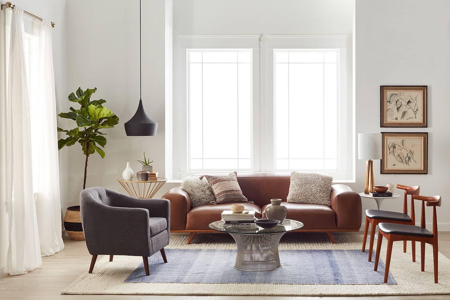
The sofa has been centered wrt the window while the two chairs to the left are aligned with the handrest of the sofa. But, the chair to the left is aligned with the seat and not the handrest of the sofa. The rug would be better placed central to this arrangement to maintain the principle of symmetry. This can easily be fixed by making small adjustments.
The Background
Colours
The colour palette in the background is defined by the white walls and light-brown flooring. Such light colours look brighter due to natural light and allow for a wider colour palette in the foreground. The colours in the foreground further introduce two secondary colours: brown, and gray.
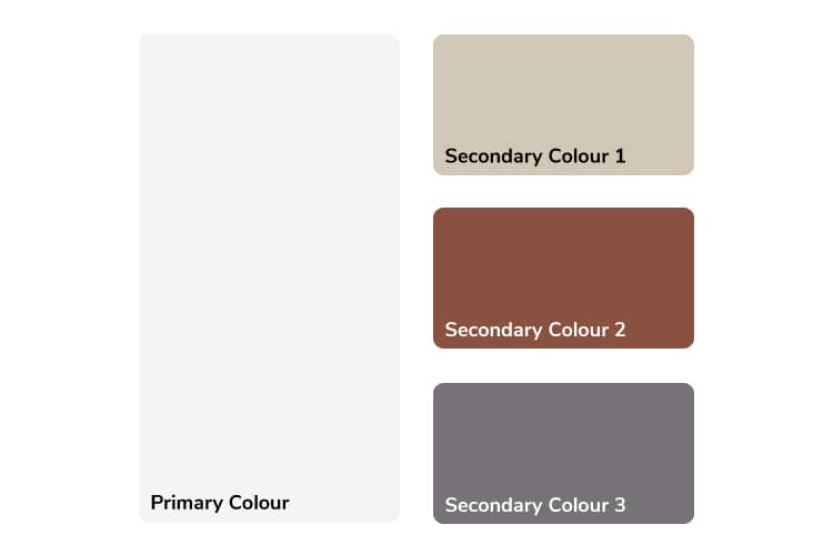
The colour palette of the entire space.
Details
Small details such as the skirting, ornamentation on window or door frames may emphasize on the underlining design style of the space. Such details are not functional but based on personal choice, they can be employed to add aesthetic value.
The Foreground
Furniture
Design Style
The chairs on the right and the sofa share brown wooden accents and their fabric, although different in colour, are similar in material finish. But despite this, the blobular form and proportions of the components of the sofa are drastically different from the rest of the furniture. The tables also do not constitue a consistent design style.
Colours and Textures
The colours of the fabrics used on the furniture are brown and gray. The materials used are also different, hence different textures: the sofa and the chairs to the right have leather finish while the other chair seems to use polyster fabric.


Decor
Object Selection
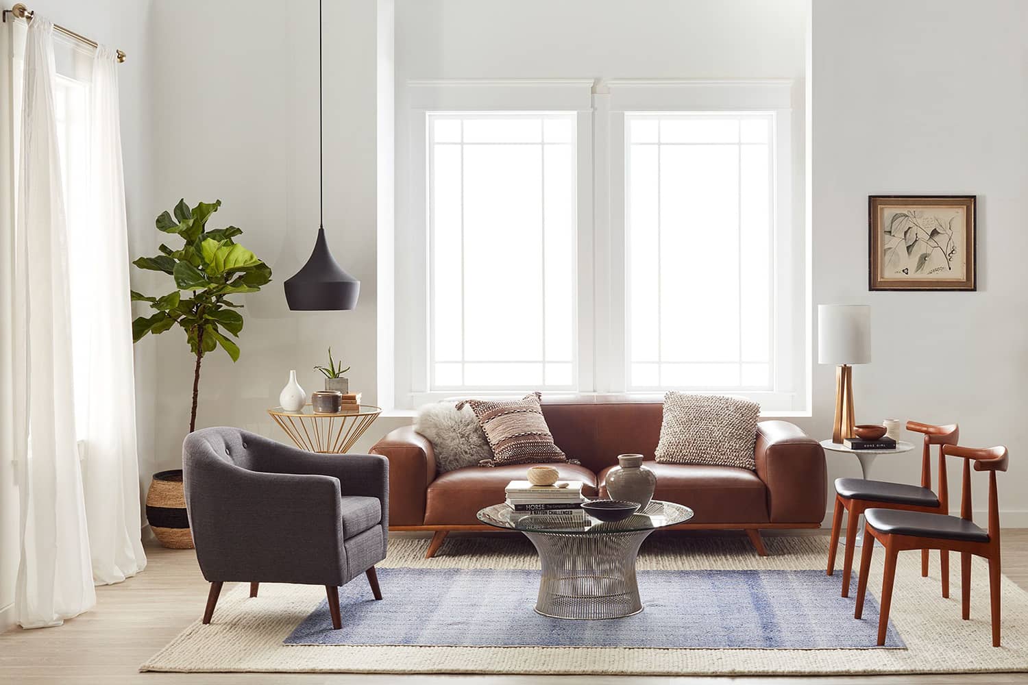
Objects such as a planter, a column of picture frames, lamps and rugs are prominent. It is practically difficult to do but if the choice of other smaller objects in any space is given due consideration, it can further improve the aesthetic quality.


Object Placement
The rug demarcates the seating by creating visual and tactile contrast with the flooring. The second blue rug and the planter introduce vibrant colours to the palette such as blue and green respectively. The picture frames to the right composed evenly create further contrast with the wall.

Summary
Applying design principles while creating a layout
Universal design principles when followed consistently reduce the effort required to make a space aesthetic. These are simple but very powerful rules that must be obeyed. Here, we can observe how the seating arrangement is centrally aligned with the window opening. The rug further emphasizes this space while the decor has been placed on either sides of this arrangement. This composition builds an overall symmetry despite using distinct pieces of furniture and decor, which contrastingly are not arranged particularly in a symmetric fashion.
Using dark, bold colours in the foreground
When light colours are used in the background, a wider palette can be used in the foreground. Here, we see the use of complementary colours: brown and blue and also gradual analogous colours: beige, brown and dark-gray. When a palette is not clearly defined, making colour choices becomes difficult. Hence, fixing a clearly defined colour palette is vital as possible choices are numerous.

