www.medium.com
Design Review 7
Things to Learn
When to create 'highlight walls'.
How to correctly use dark, bold colours on walls.
The Layout
Arrangement
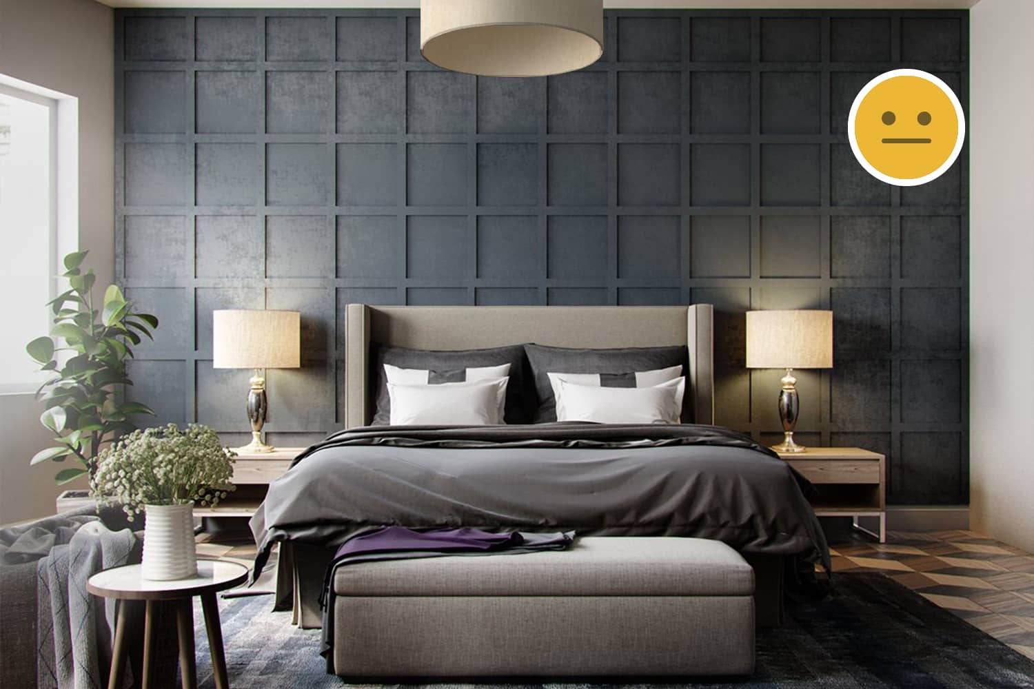
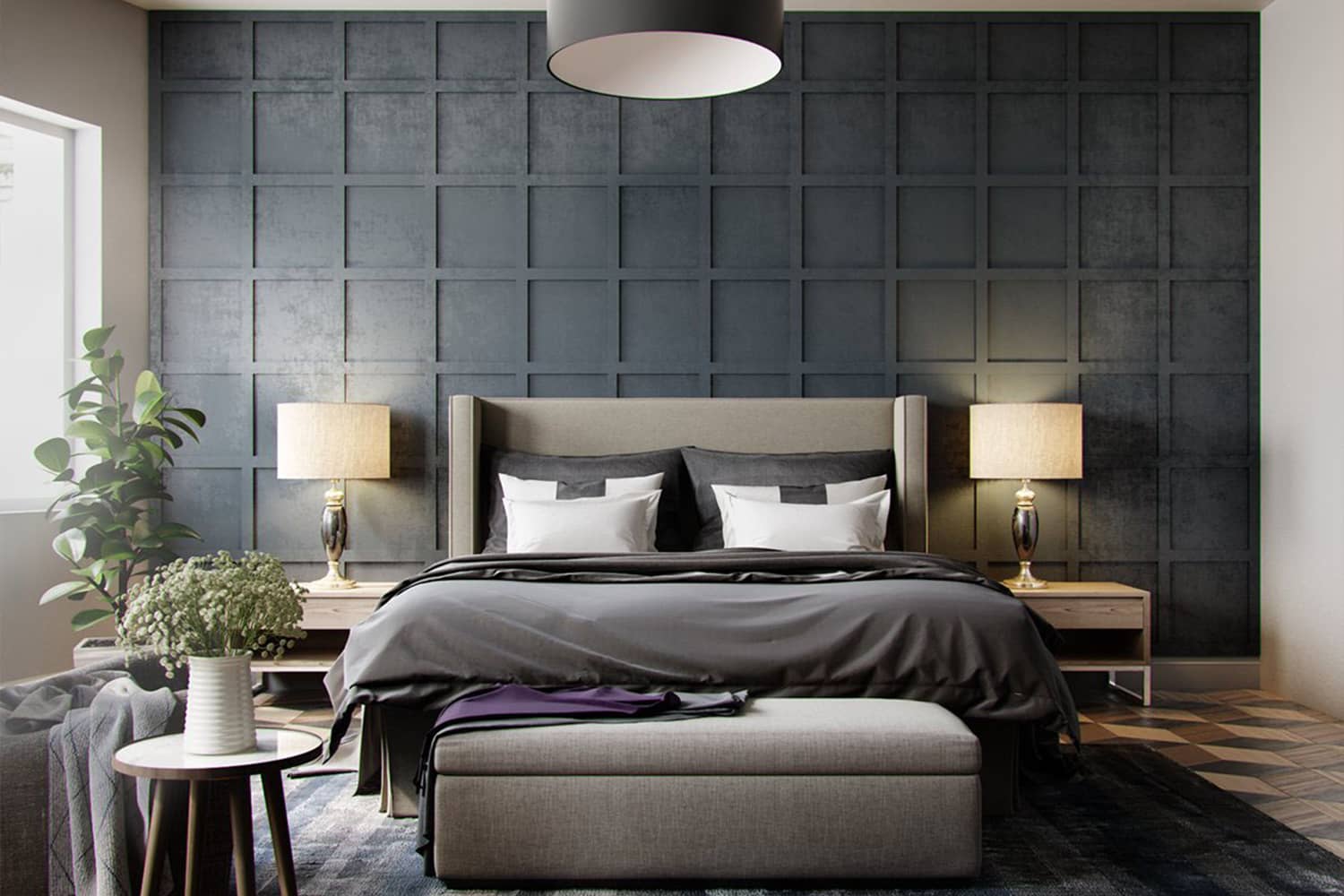
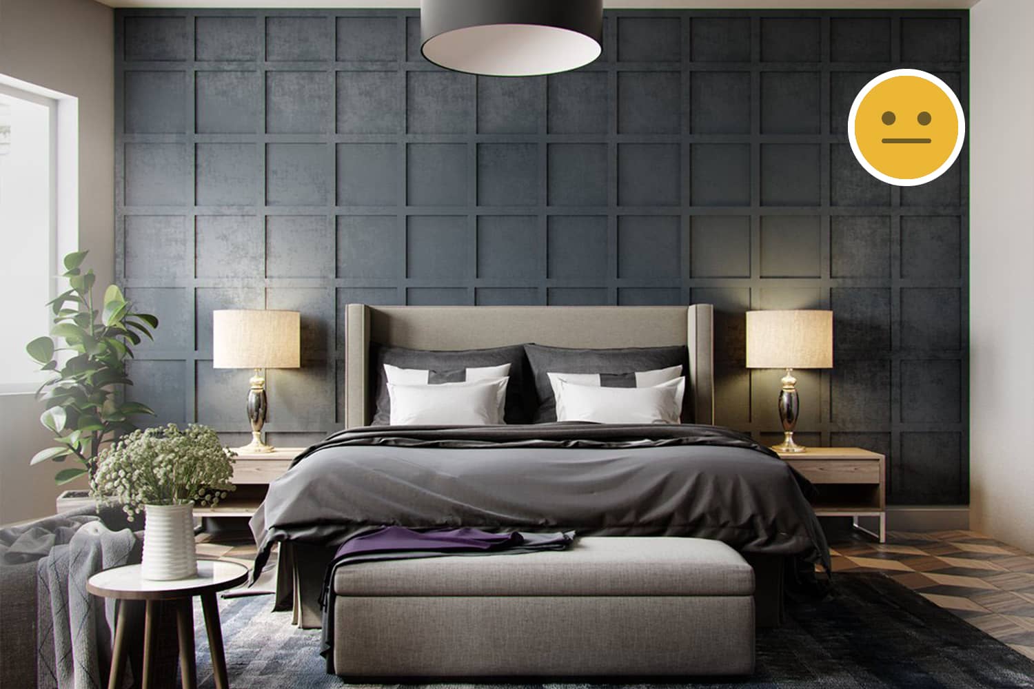
The bed is placed very close to the center leaving almost equal passages on either side. The two side-tables and bed foot-bench serve the user with better functionality and comfort. We can also see a wing-chair to the left of the image. The bedroom seems to be of a comfortable size.
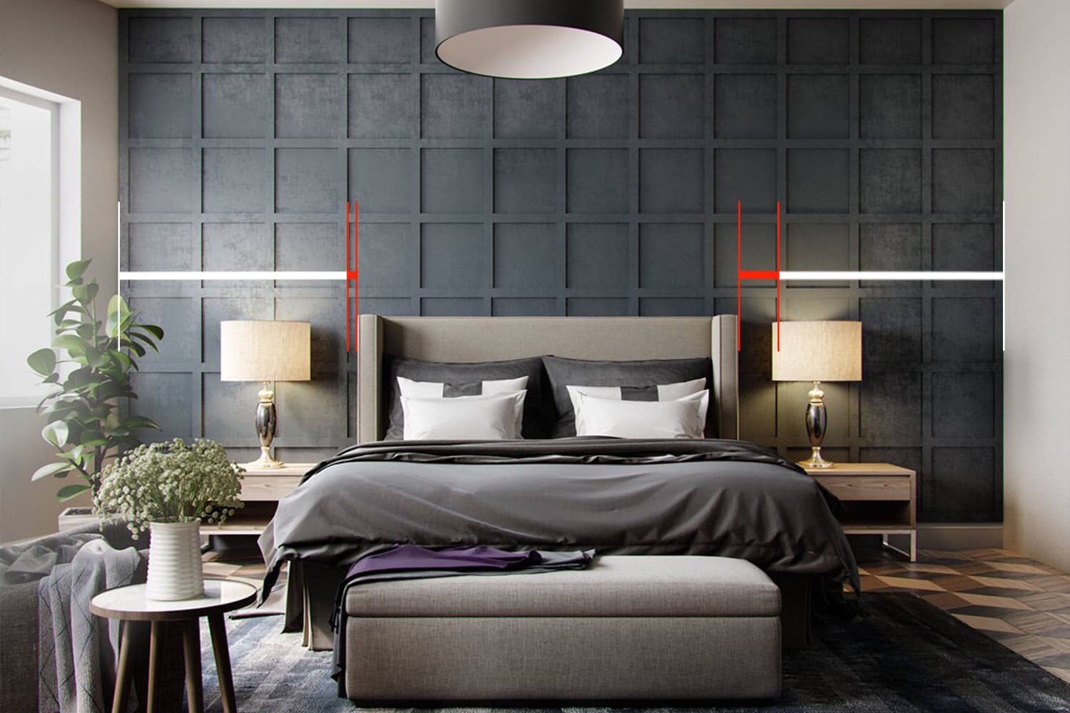
The bed can be placed perfectly in the center of the room to maintain symmetry and improve the aesthetic value of this space.
Light
The lampshades on each side-table and ceiling light provide task and ambient light respectively. From what is visible of this space, natural light seems to be satisfactory.
The Background
Composition
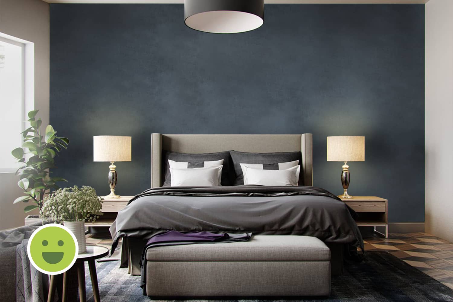
The wall behind the bed is an example of a 'highlight wall' from popular culture. These are used to create a point of interest and avoid making a space dull. Here, we see a composition in the form of a grid that does not aid functionality. In such scenarios, it is important to explore all possible options as they all are only pertaining to style, not function.
In this example, this grid poses a huge challenge to maintenance and the rectangular grid on the top row would have been better placed toward the bottom as a large chunk of the wall is covered by the bed. This would have been better to hide the indiscrepancy. Contrastingly, the grid does a perfect job at fitting the length of the wall.
Colours
The palette in the background is composed of complementary colours like the navy-blue wall and brown flooring. Other walls are neutral white.
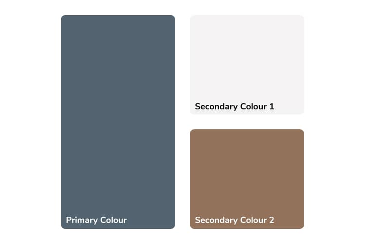
As observed in this case, complementary colours when used become the primary and secondary colours in the palette.
Patterns and Textures
The wooden flooring has diamond-shaped pattern to introduce shades of beige, brown and dark-brown. The biggest challenge with such flooring is how the edges are defined when it meets the wall. Here we can observe that this happens quite abruptly. This points to the poor decision making in the selection of the pattern.
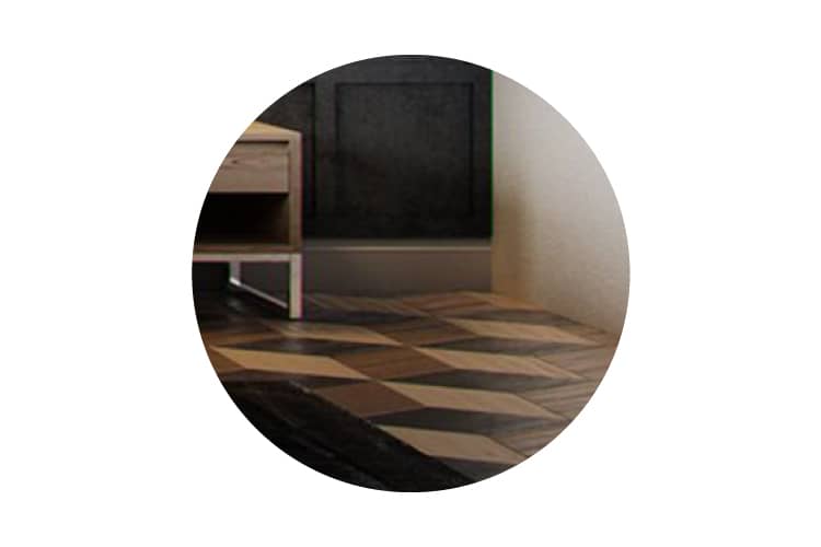
The diamond pattern is not finished properly at the junction where the flooring meets the wall. In is unclear why only one wall has skirting and others don't.
The Foreground
Furniture
Design Style
Each piece of furniture in the image has a distinct design style. The shape, size, style and finishing materials of the side-tables are different from the other stool with a planter on top of it. To maintain consistency and yet introduce variation, design styles for furniture can be categorised by function; for example: seating, storage, etc. can have their respective styles.
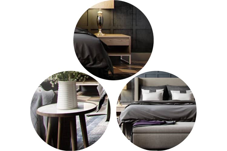
Clockwise from top-left: The side table, bed and foot-bench; another table, all have distinct and discordant design styles.
Choice of Upholstery
The upholstery on the bed's headboard and foot-bench is stitched differently. The slightly warm tint on the grey headboard allows for a wider range of colours for other linen as it is closer to a neutral palette.
Decor
Object Selection
The rug provides tactile contrast to the hard flooring while the linen and plants contrast with the hardscape in this space. The supports of the lampshades are distinct in shape and material-finish from any other object in this space. This inconsistency can be dealt with by specifying accent colours and using them. For example: golden accents like on the lamp-shade supports may have improved the aesthetic quality if they were used consistently on other objects in this space.
The design style of the ceiling light is different from the lampshades. This might also seem inconsistent but despite being just lights, they serve distinct funtions and are located in different places. So, they need not share the same style.
Linen
In any bedroom, the linen used on the bed such as bedsheets, pillow covers or blankets occupies a large surface area whose colour range is a product of what colour is used in the background. Hence, it is vital to use background colours that allow for greater variation in the colour of such linen as it can be changed periodically.
Summary
When to create 'highlight walls'
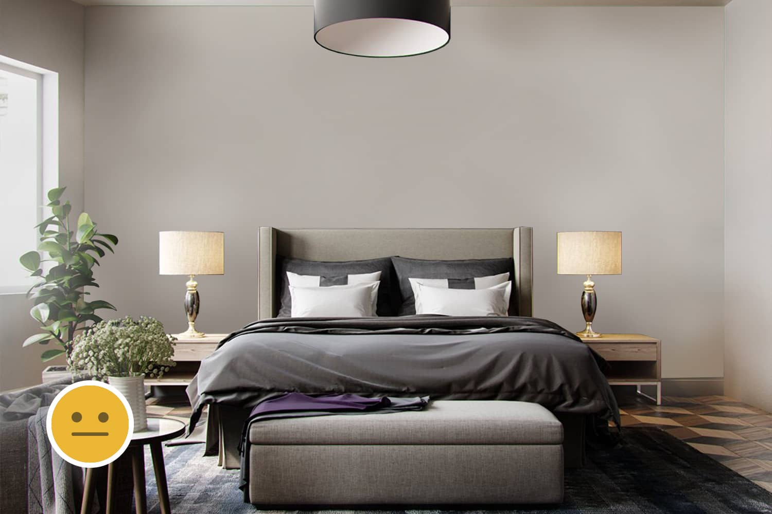
'Highlight walls' employ contrasting colours or textures to create focal points. But when done, the object of focus is not what is in front of the wall but the wall itself. If the idea is to create contrast for no clear reasoning, such walls serve no purpose. If 'highlight walls' are to be built, factors such as budget, maintenance and effect on adjacent spaces must be considered strongly.
Using dark, bold colours in the background
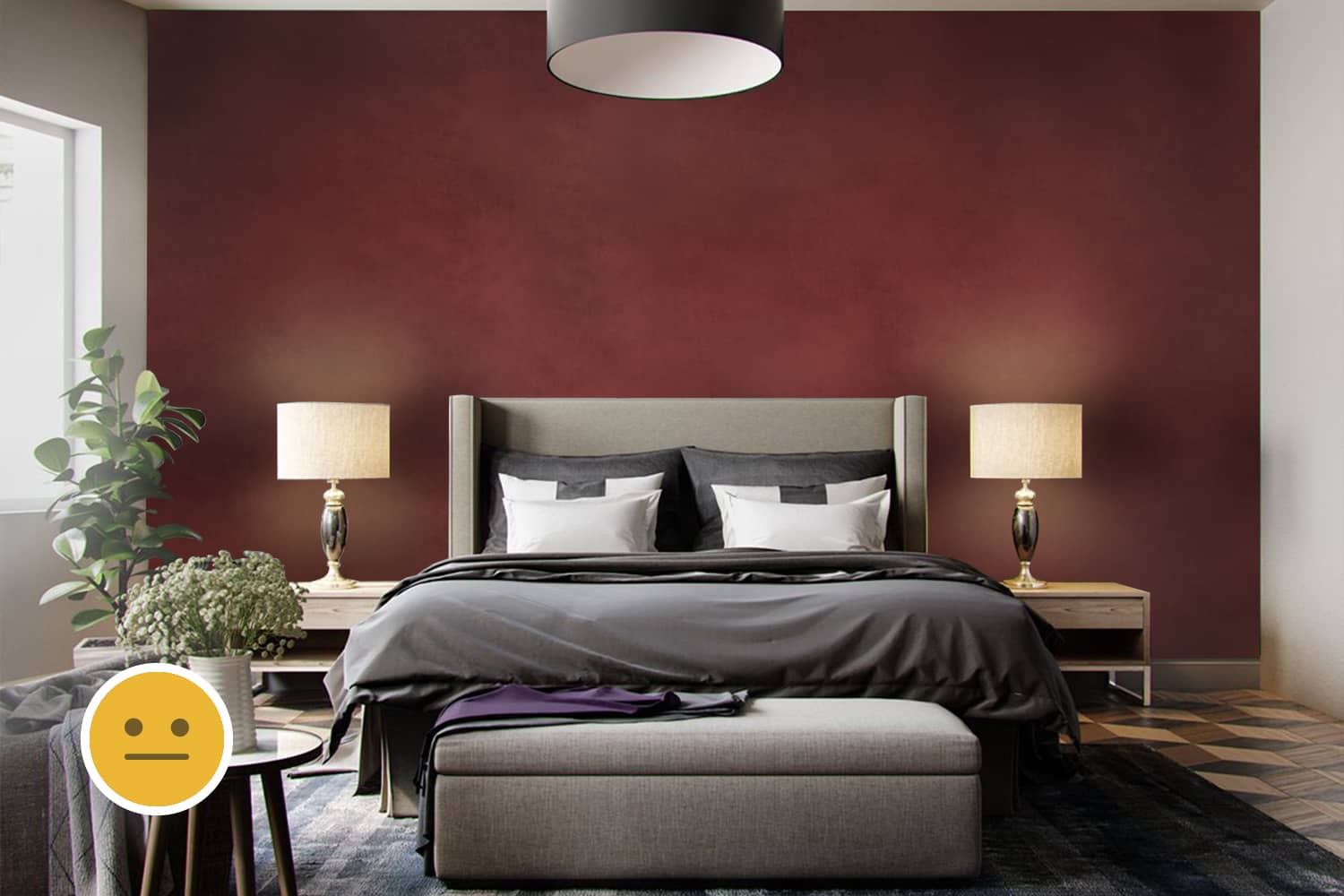
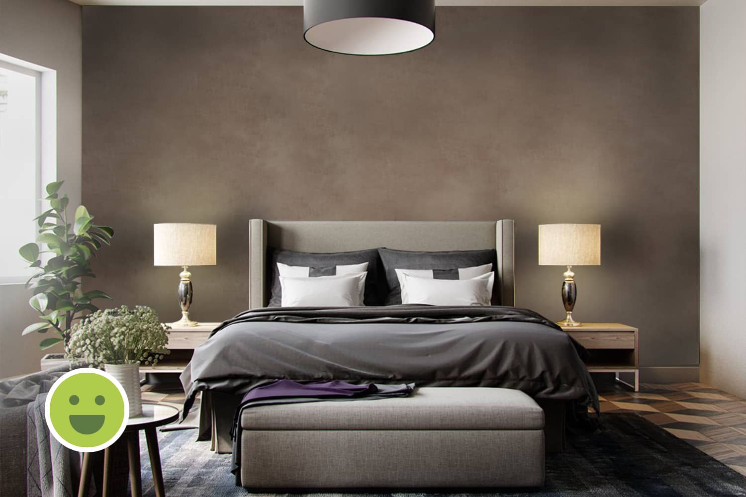
If cool or dark colours are used in the background, they must be neutralized by warm or light colours respectively and vice-versa. Not doing so risks the space feeling either too dark/ bright or too dull/ vibrant. In such cases, complementary colours fare better than analogous. Here, we see navy-blue walls and brown flooring both of a darker shade contrasted by neutral light grey and beige colours on the upholestery and linen. This has prevented the room from looking dull.


