www.home-designing.com
Design Review 6
Things to Learn
Why creativity should not be an excuse to breaking universal design principles.
Why using correct lighting in a room is important.
The Layout
Arrangement
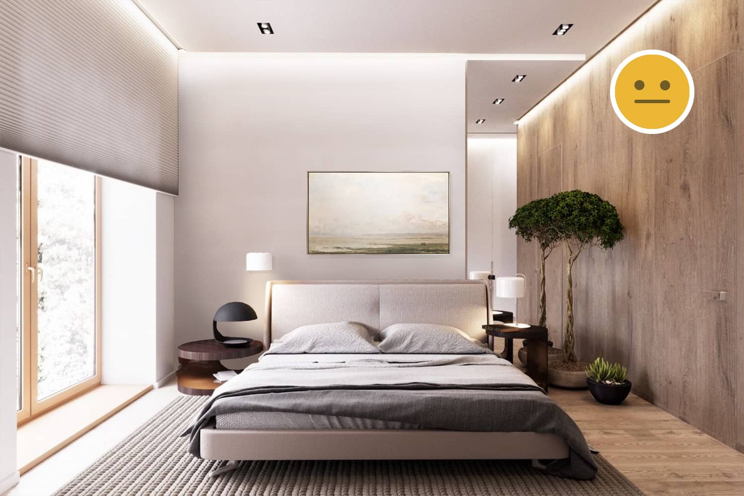
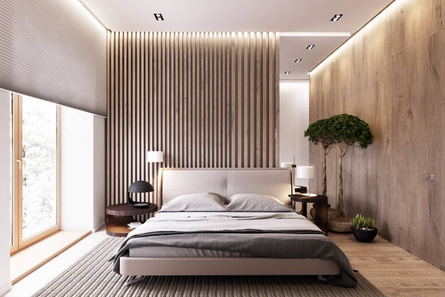
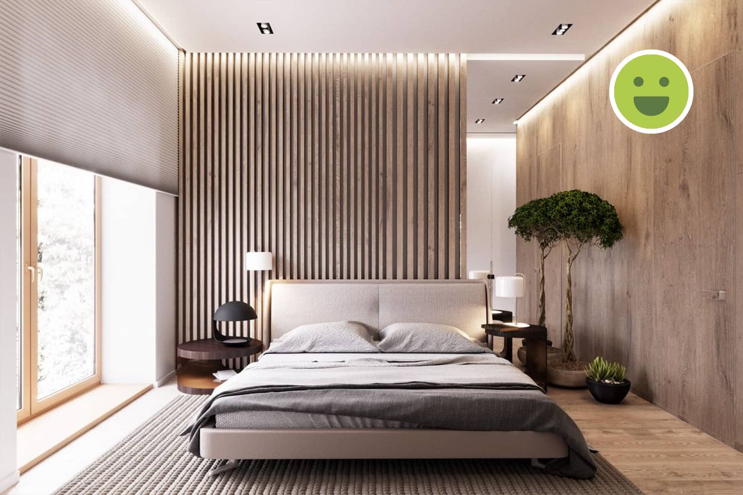
The bed is positioned correctly with ample circulation space around it. Side-tables on both the sides are a bonus.
Artificial Light
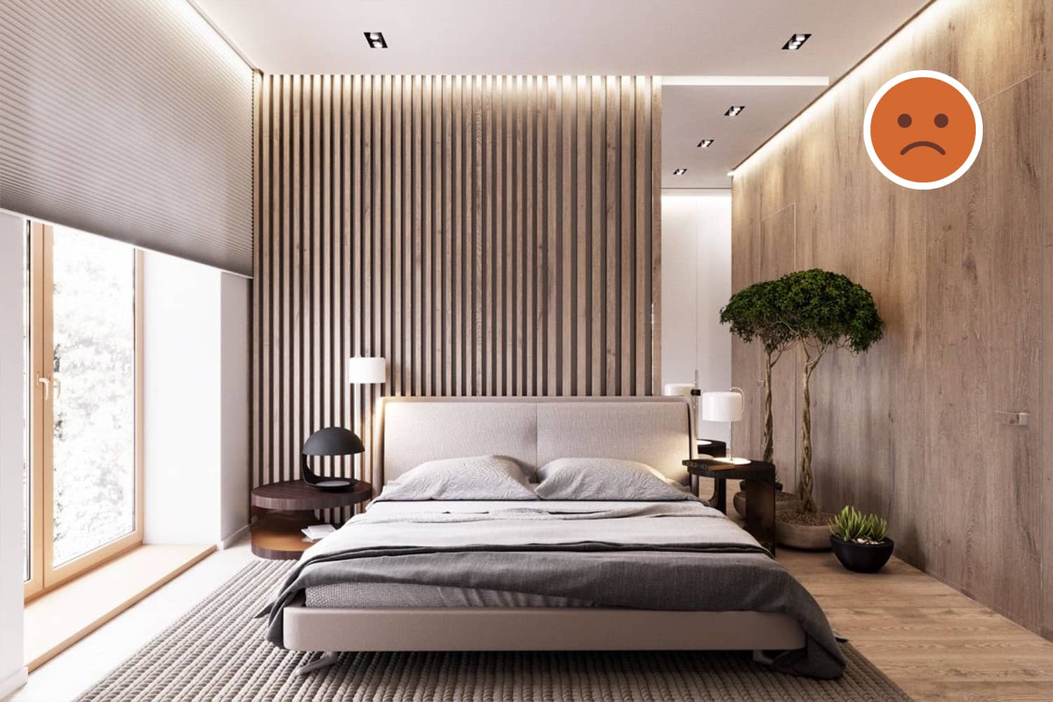
Task lights are used to illuminate a particular area to facilitate the user. Accent lights are used to accentuate an artifact or an object worthy of attention. But, here we can see the use of such lights without a clear understanding of what is being facilitated or focussed at (except for the table lamps). In any room, ambient lights are necessary and their purpose should not be ignored.
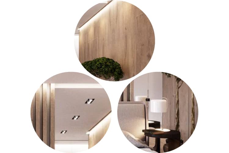
Clockwise from top-left: Accent lighting; task lights in the form of lamp-shades; task lights on the ceiling.
The Background
Composition
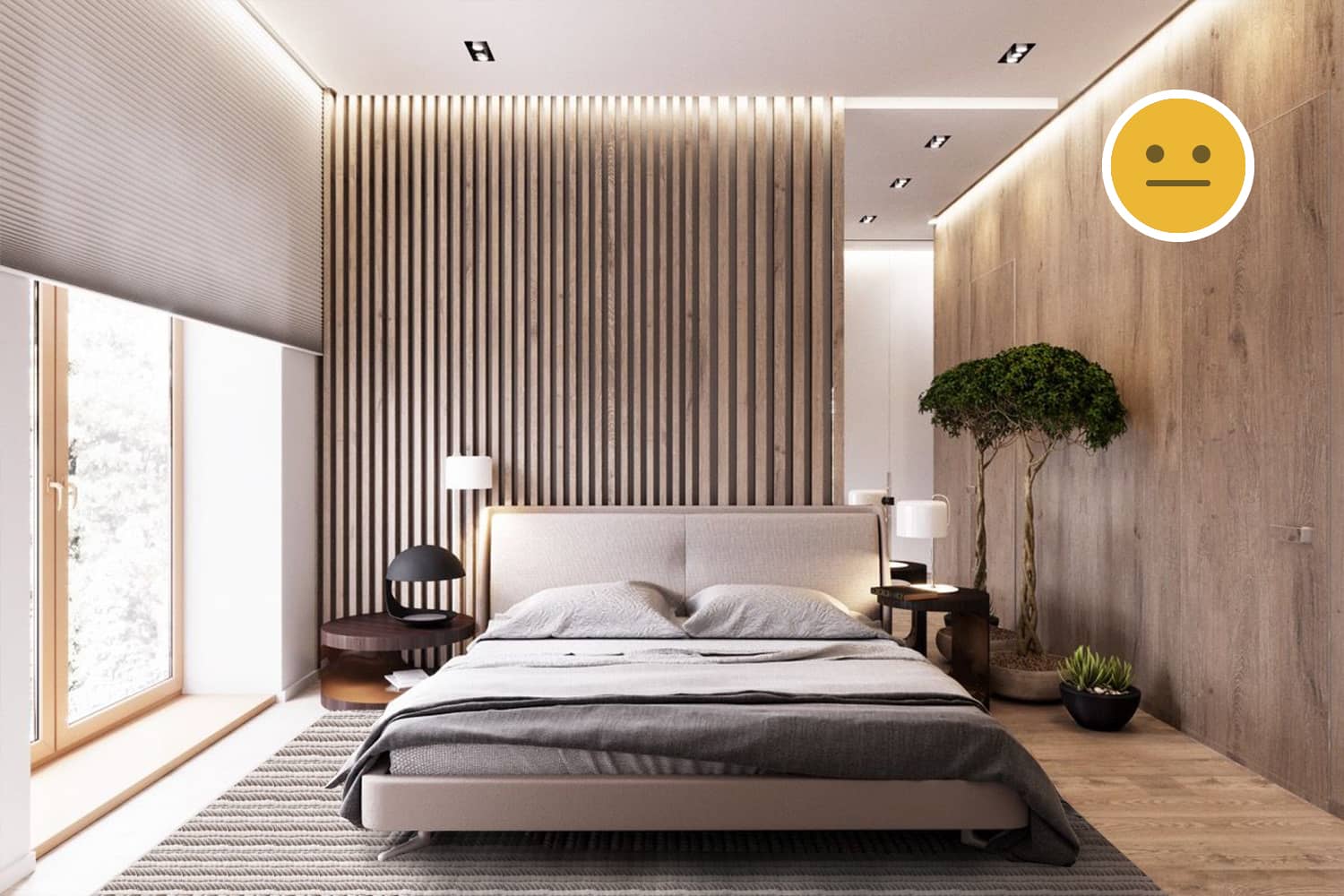
The purpose of the background is to provide the right setting for the foreground. It is unclear why the background has four different types of surfaces: The white wall to the left, the wall with wooden slats in the center-left, the mirror in the center-right and finally the wooden laminate on the right wall. If such composition is the result of an attempt to make the space look interesting, it is important to analyze all possibilities and implement that which is justified by relevant principles.
Colours
The primary colour is brown while the secondary colours are neutral like white and grey. The artificial lighting has rendered a tint of warm colours and at some spots has saturated portions on the wall. This may create unjustified contrast and hence should be considered before implementation.
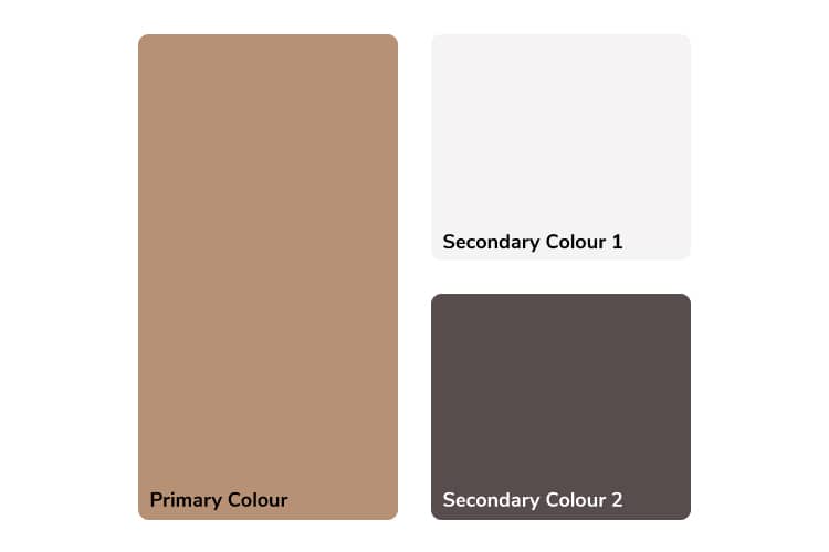
The colour palette in the background is made up of analogous colours.
Patterns & Textures
The walls and the floor are covered by laminate sheets which may or may not offer tactile texture but certainly add visual texture to the background. It is unclear why only one wall has laminate but the other doesn't.
The Foreground
Furniture
Design Style
The design styles of the bed and the side-tables are contrasting. Materials used in both are different. The bed has thick metal accents while the side-tables have none and are circular in plan. All furniture need not be of the same style but variation amongst furniture pieces such as the side-tables should be justified.
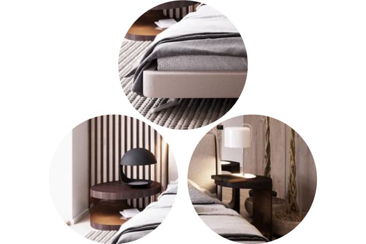
Clockwise from top-left: The bed accent and support; a taller side-table to the right; a shorter but larger side table to the left.
Materials
The bed seems to be made of aluminum while the side-tables of plywood and laminate. Hence, different finishes: the bed is brushed-metal grey while the tables are brown.
Decor
Object Placement
There are three lamps: one floor, one wall and the third table mounted. Given that the purpose of a bedside lamp is task lighting, the wall-lamp is incorrectly placed behind the bed to the left. Also, this third lamp is not required anyway.
The rug is assymmetrically placed under the bed. The rule of symmetry should be broken only if justified. Here, the door to the right must have led to this decision. The planters in the right corner of the room may affect the functionality of the mirror in the background. The type of plants used should be given good thought.
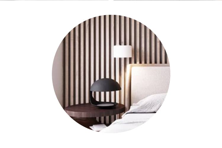
The wall-mounted lampshade is not required as there are already two other on each side-table.
Colours
The decor aids the creation of an analogous colour palette. The green plants introduce natural colours to the palette. Two lamps are white while the third one is black. Using opposite colours needs justification that is absent here. The rug and the linen used on the bed further support the colour palette.
In any bedroom, a large surface is covered by the bed-linen. Hence, the choice of colours on this linen is vital to regulate the desired colour palette.

The colour palette of the decor supports the analogous palette of the entire space.
Patterns & Textures
The pattern on the rug matches that on the background wall. The rug also introduces contrasting texture to the hard flooring. The fabric on the headboard adds to the comfort of the user.
Summary
Limiting creativity to obey design principles
Until universal principles such as symmetry, simplicity and complexity, etc are not broken, the quality of a space grows richer. While they are obeyed, creativity may thrive to create ingenious ways of creating beautiful spaces, but it should never be an excuse to break such universal principles like we see in this case.
Using artificial lighting correctly
Ambient lights are the primary source of lighting in a space. They are used to illuminate the entire space evenly. Task lights are used to illuminate a particular area to facilitate the user while accent lights are used to accentuate an artifact or an object worthy of attention. While meeting their specific functions, these lights may be fixed in fancy fittings. Here, the absence of ambient lighting highlights poor decision making.

