www.freshome.com
Design Review 5
Things to Learn
How to use white as a primary colour.
Why high-contrast is not neccessary to create an Ambience.
What kind of storage to place in the living room.
The Layout
Natural Light
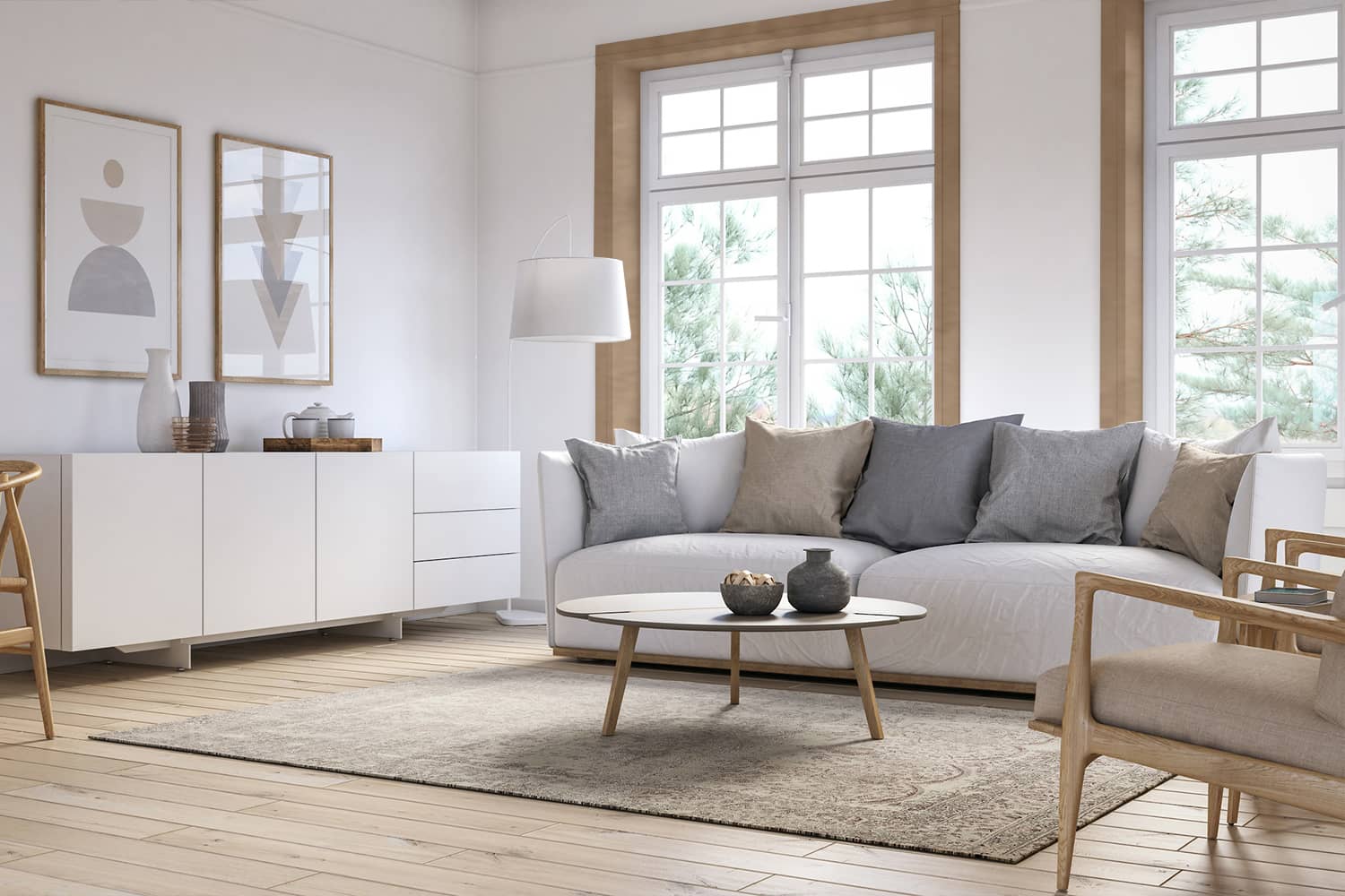
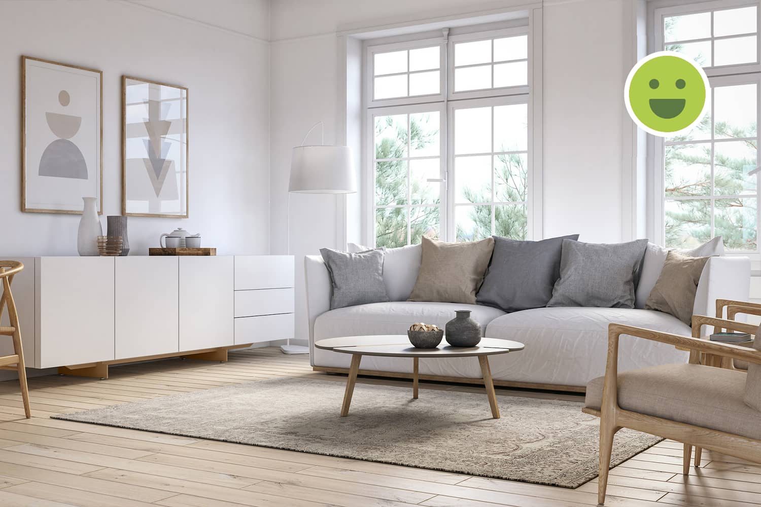
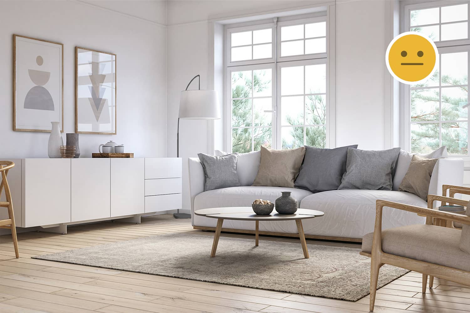
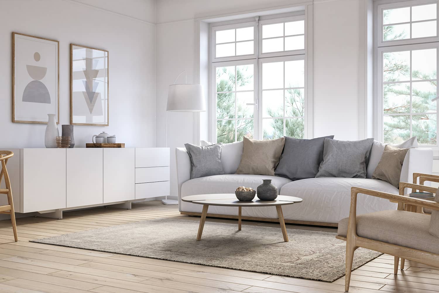
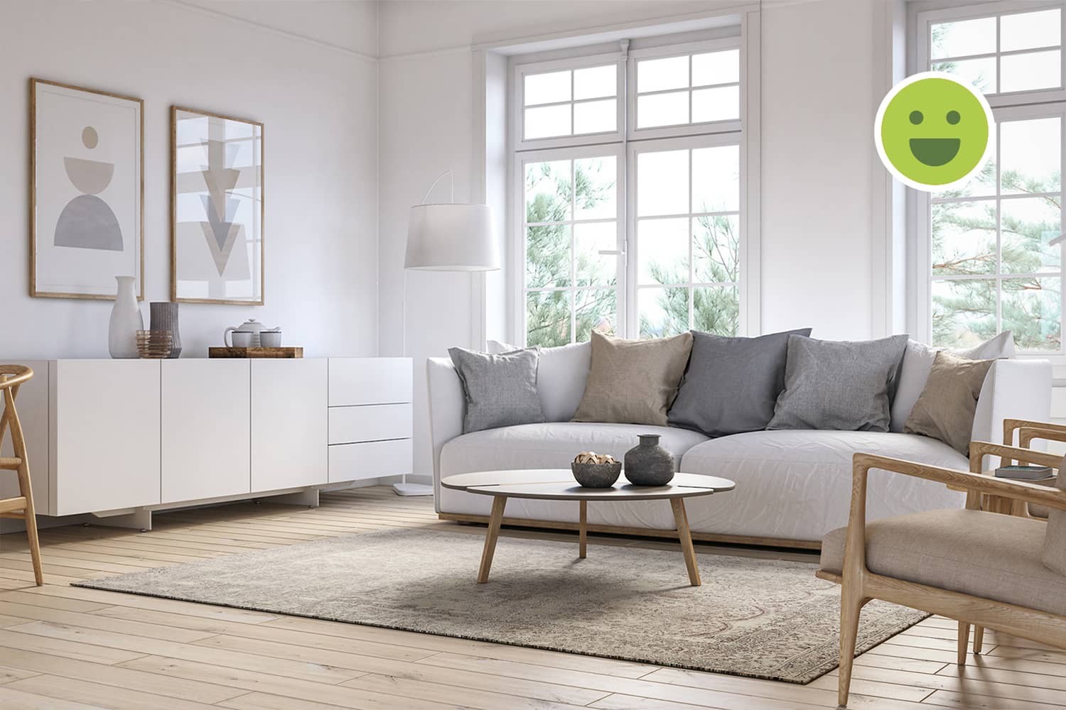
The room is very well lit because of the two huge windows. The light makes the space look more expansive.
Storage in the Living room
It is unclear why the storage rack is placed to the right of the sofa. Since we cannot see the rest of the space in this image, we can conclude that it probably was a functional requirement due to space constraints. In this situation, the storage is appropriately placed adjacent to a corner in the room, away from the windows and seating.
The Background
Colours
The white walls contrast slightly with the light-brown floor and their intensities make them the primary and secondary colours respectively. The room has a warm tint because of the bright light from the windows.
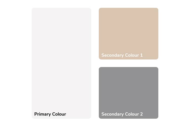
A palette comprising of light analogous colours.
Considering both Background & Foreground
The white window frames merge so well with the walls that they are unnoticiable. The flooring is also of a light shade. But both of these could have been darker to create good contrast. This decision will ultimately decide what kind of foreground will suit this space well. But, this is a back-and-forth process which requires consideration of both as variables and analysing various possibilities to achieve the desired Ambience.

Patterns & Textures
The walls are plain white and do not have any texture while the pattern of the wooden flooring although subtle along with its texture, highlights the use of natural materials in the room.
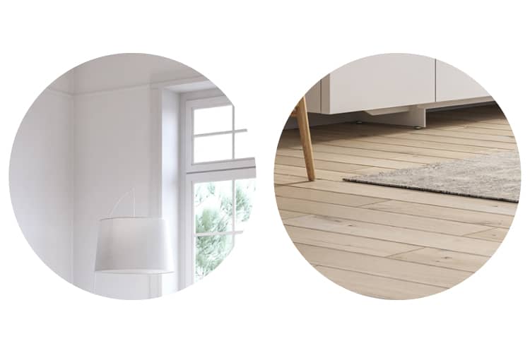
From left to right: Plain white walls; Natural wooden floor with a rectilinear pattern.
The Foreground
Furniture
Design Style
The chairs have a wooden frame and have organic curves. The curves, fabric on and wooden accent under the sofa helps it resonate with these chairs. Otherwise the sofa is a very different style. It doesn't look bulky because of the bright-white setting. But, clearly the storage rack is a misfit here primarily due to its rectilinear shape and then its matte finish.
Colours
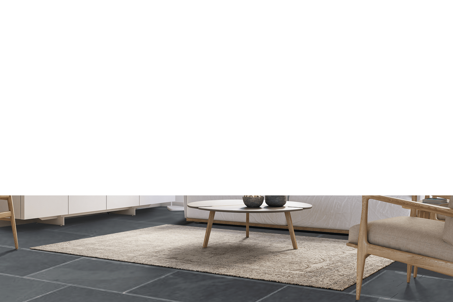
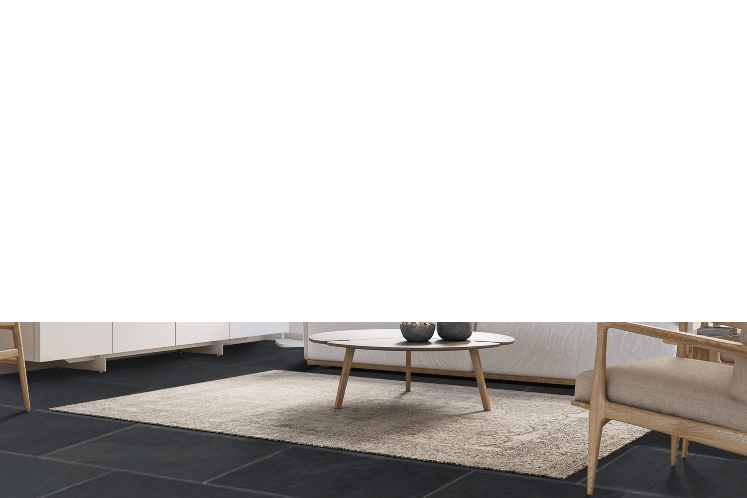
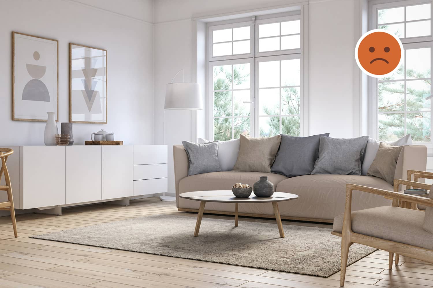
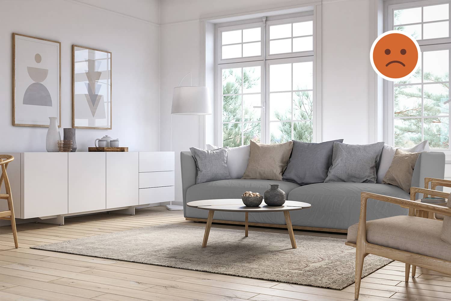
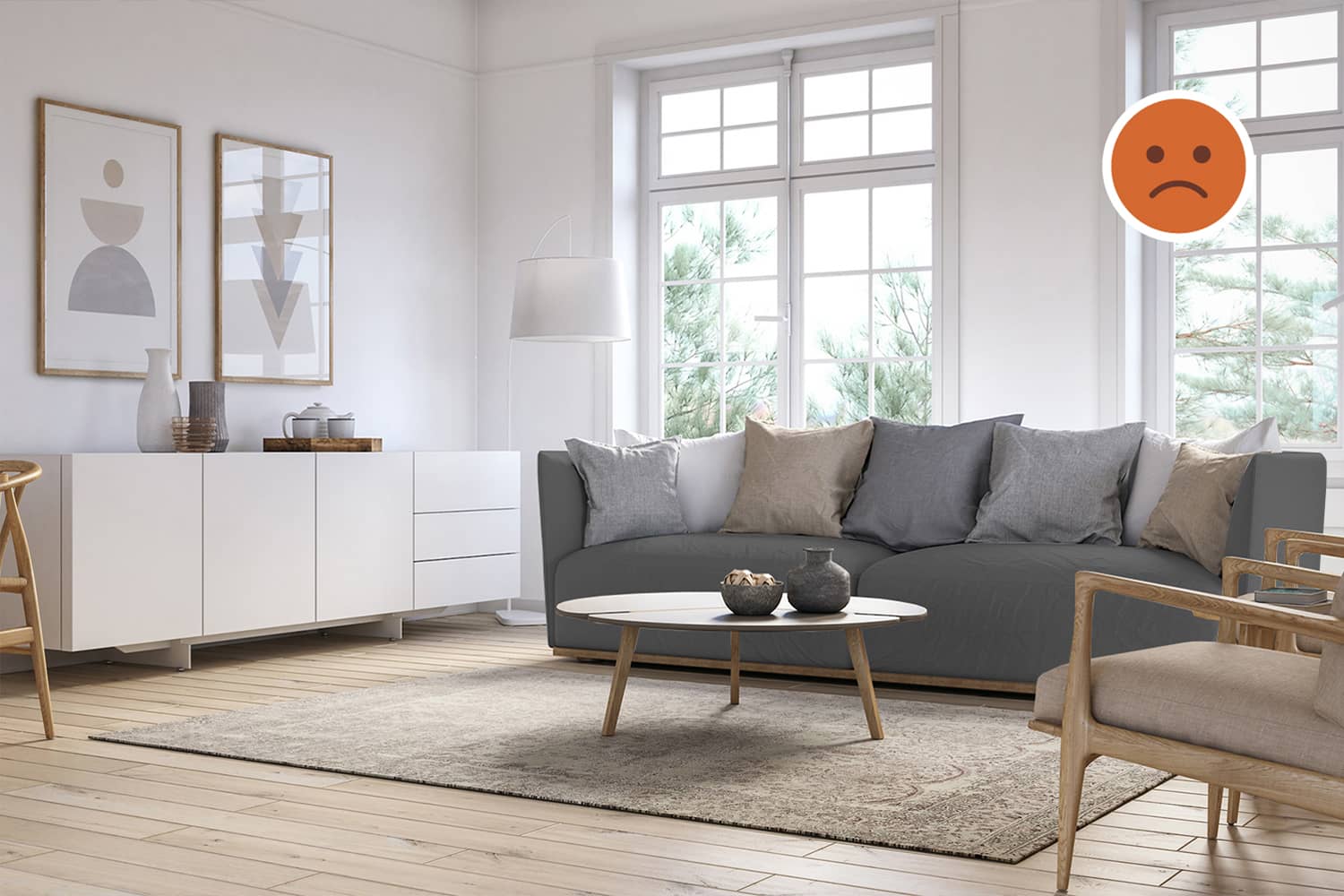
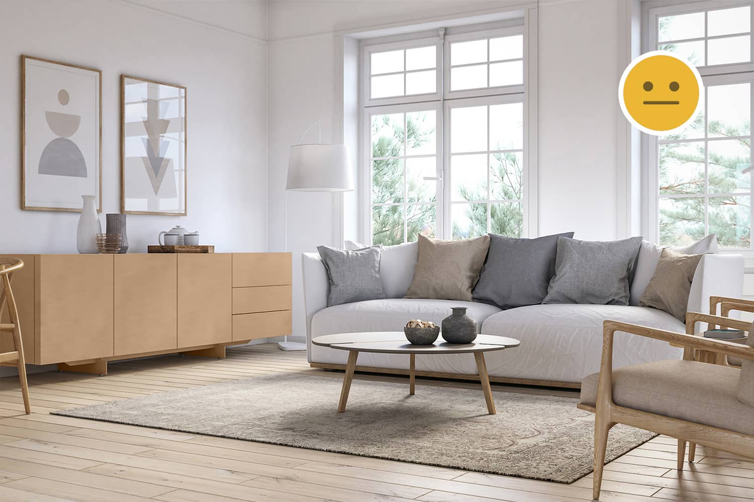
The colour palette used in the furniture is consistent with that of the background. This creates little contrast but leads to an analogous colour-scheme. The storage rack is appropriately coloured white to not create any contrast and be noticiable. The exercise below demonstrates that use of consistent materials leads to design harmony although not as strongly as consistent design styles.

Decor
Object Placement
The artwork framed on the wall is symmetrically placed above the storage rack. This resembles the composition offered by the windows behind the sofa. The floor lamp placed in the corner behind the sofa reduces the number of objects in the foreground.
Colours
The artwork contains the same colours as the room's palette. In addition to this, the light-brown frame accentuates it just like the furniture is emphasized by wood. The white lamp is almost invisible in the setting. The rug is a shade of the flooring to avoid creating high contrast. Other smaller objects like the cups, jugs, trays etc seem to be use similar materials and also respect the existing colour scheme. Finally, the pillows on the sofa add new colours into the setting. Being neutral but slightly dark, they do create some good contrast. Such attention to detail is worthy of admiration.

Summary
Using white as a primary colour
Natural light has the ability to brighten or darken spaces. When there is ample light, white tends to dominate the colour palette and if used in enough quantity becomes the primary colour. Then the important decision to make is whether to use light or dark shades to create either sober or high-contrasting spaces. Adding colours is often defined by the flooring / secondary colour. In such cases, an analogous colour palette as we see in this case becomes the more logical and elegant choice.
Creating an ambience without high-contrast
Most of our experiences in the outdoor environment comprise of settings defined by analogous or low-contrasting colours. High-contrast settings also exist but they seldom comprise of complementary colours. Hence, while creating an Ambience, high-contrast is not neccessary. It merely depends on which experience we wish to relive.
Placing storage in the living room correctly
Placing storage in living rooms may clutter or negatively impact the aesthetic of such social spaces. In order to avoid this, it is vital to use storage that is consistent with the design style of the rest of the furniture in the room. In this case, we can see that the storage is coloured white to minimize its effect on the overall aethetic but due to a different design style and material usage, may still stand out to a keen eye. It is still a good attempt but could have been carried out better. It is important to note that consistency in design style precedes consistency in material choice.


