www.freshome.com
Design Review 4
Things to Learn
How to create an open layout and still have multiple distinct spaces.
How to correctly use dark, bold colours on walls.
How to use different pieces of furniture and still ensure they share similar design style.
The Layout
Natural Light
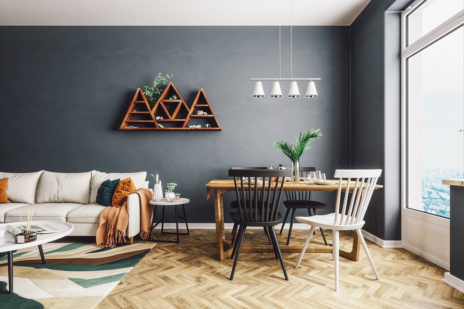
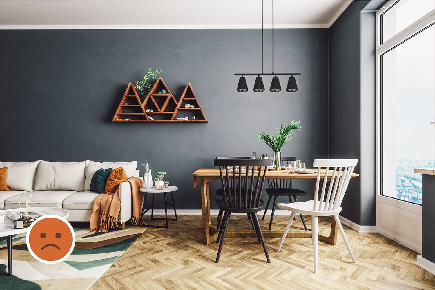
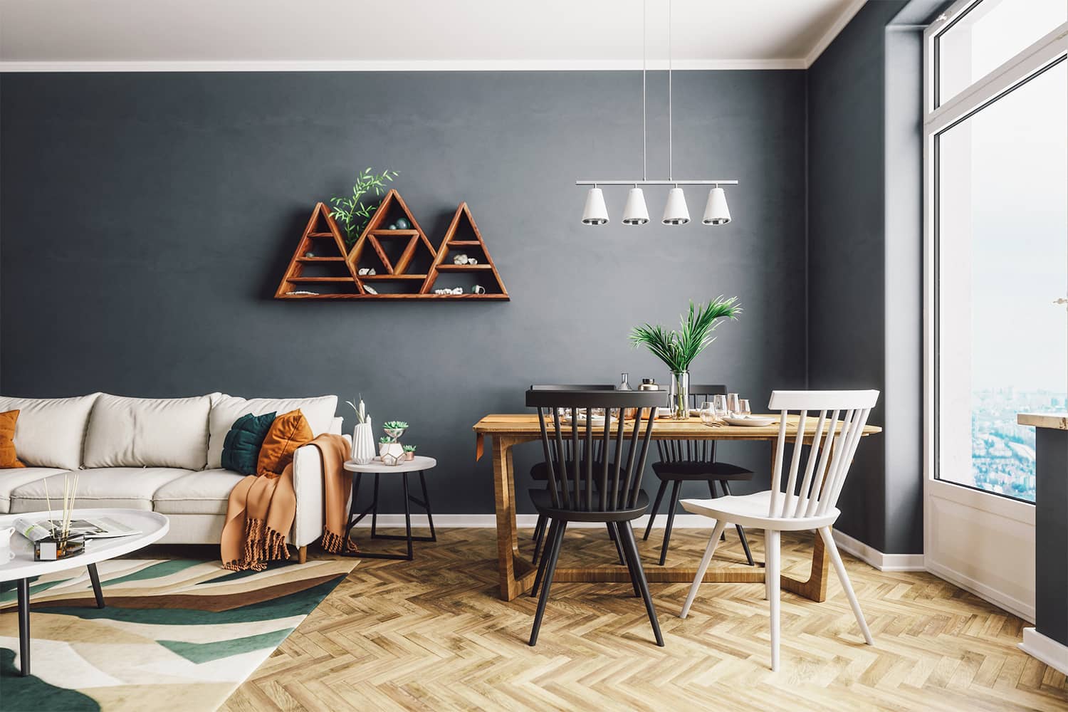
The room is well lit. Being on a higher floor, curtains have been avoided without compromising privacy. This has also maximized natural light.
Layout
The living area is a public space while the dining area is semi-private. Here, the living area seems to be near the entrance (not visible in the image) while the dining is placed slightly away in the corner near the big window. This layout facilitates an open plan without using walls.
The rug demarcates a boundary between the living and dining area.
The Background
Colours
The cool blue-grey wall and warm light-brown flooring are complementary colours. The white ceiling is neutral and helps create more contrast. Being most widely used in this space, blue-grey is the primary colour while light-brown and white are secondary colours.
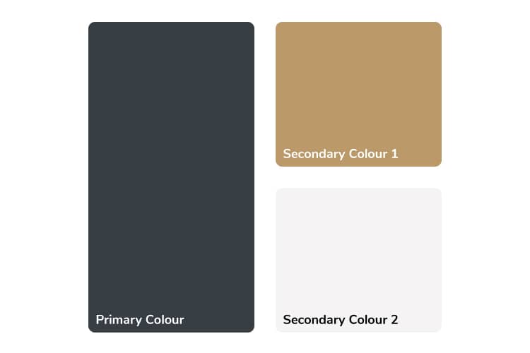
Using complementary colours in the background creates high contrast and often become the primary and secondary colours in the palette. This may limit the colour choice in the foreground.
Patterns & Textures
The grainy-wooden floor with the herringbone pattern adds tactile and visual contrast. Such variation offers a richer experience of the space.
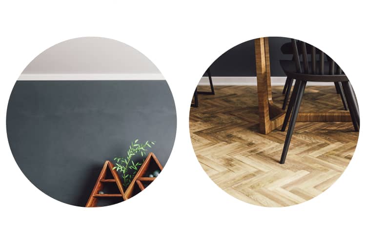
From left to right: Plain ceiling and wall; Herringbone pattern on the wooden floor.
Accents
The white skirting on the flooring and molding on the ceiling add an accent to the background. The skirting-band merges well with the white window frame adding continuity to its length around the room.


The Foreground
Furniture
Design Style
The most important binding factor in interior design is the style of furniture and not material. In this case, the dining table is of a different material than the rest of the furniture. But it still binds well as it shares a common style of supports, i.e. the slant legs of rest of the furniture.
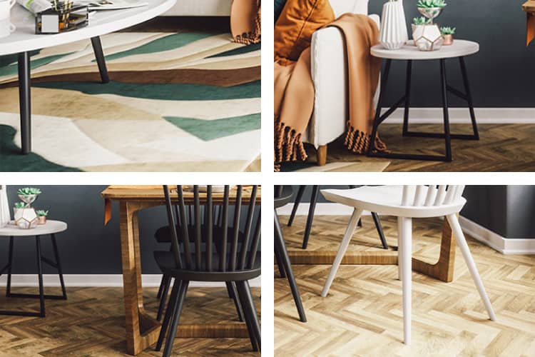
Clockwise from top-left: The slant supports of the center-table; side-table; chair; dining table consititute the binding element of the design style.
Colours
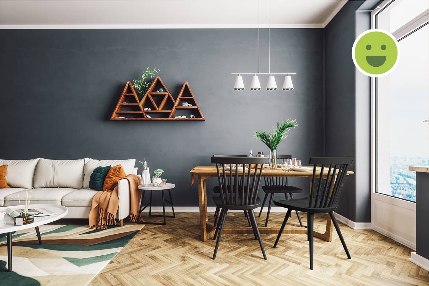
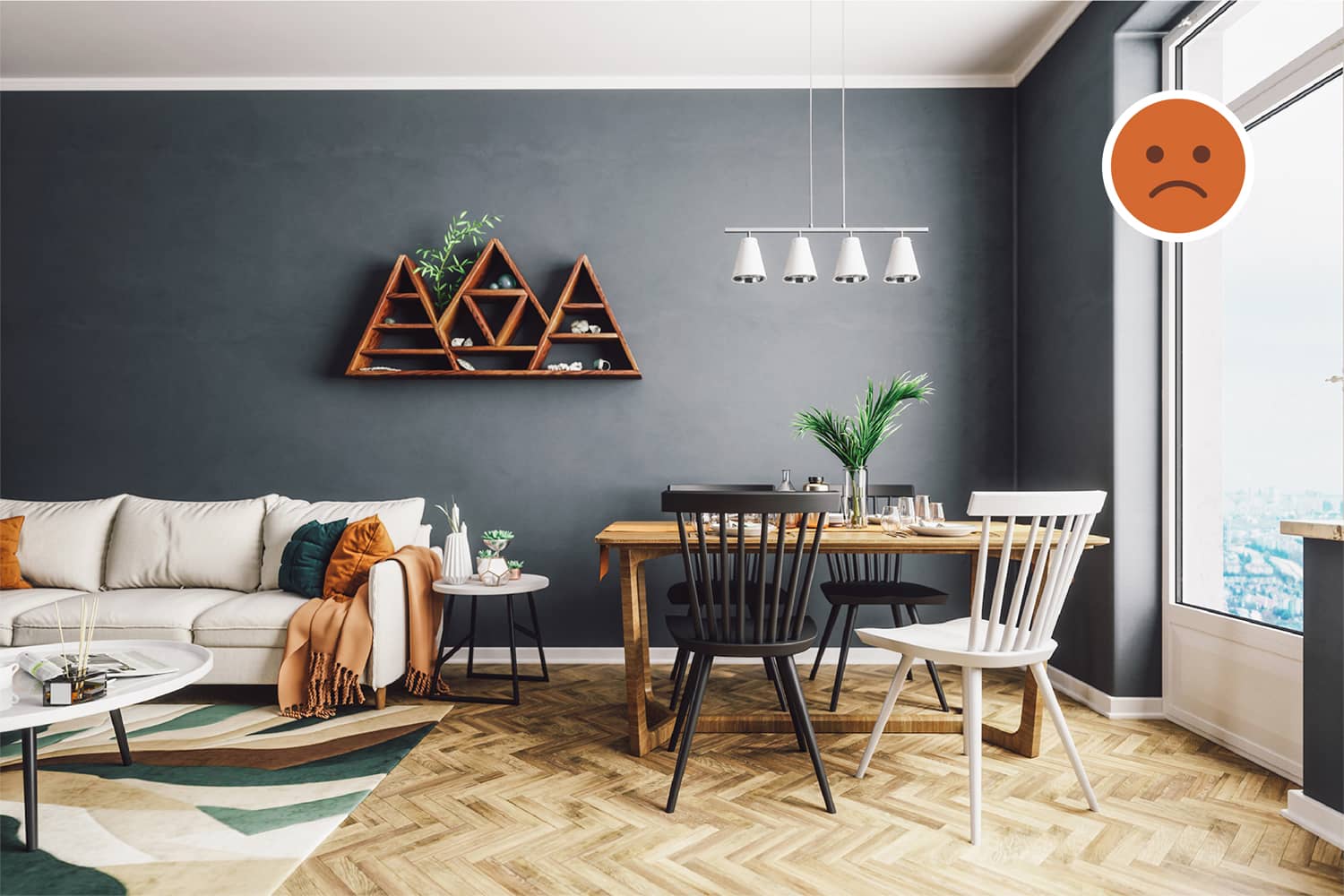
The intent of using contrast is to highlight an activity, object or a space. In this case, the interaction would happen around the dining table while sitting on the chairs. So, the dining table should be highlighted and not one of the four chairs. Thus, the inconsistency in the colour of the chairs is unjustified.
Decor
Spatial Distinction
The rug helps demarcate the living area and distinguishes it from the dining area. Its texture adds to the distinction and is a good example of how different spaces can be created without using walls or other vertical barriers.
Object Placement
The triangular showcase on the wall is currently placed between the living and dining area. As a composition, it should not span multiple spaces and should be contained only in one space. In this case, it is best to place it on the wall aligned to the center of the sofa.
The showcase should be contained within one space and should not span multiple spaces.
Colours
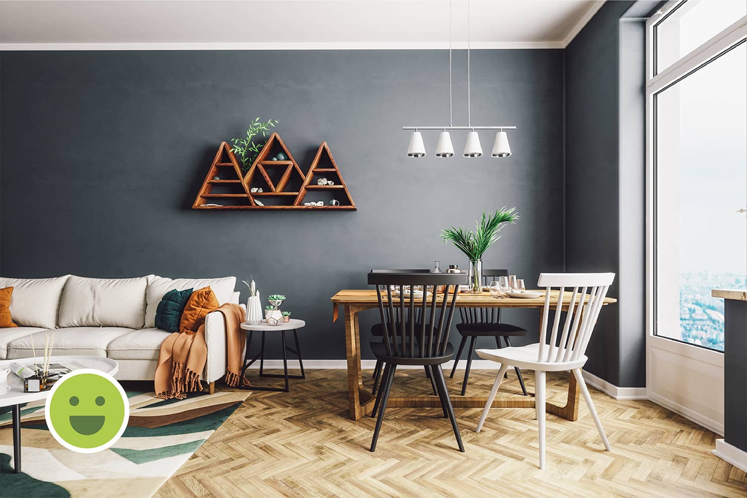
The rug and the cushions add bright new colours to the décor. Since these colours are variants of the primary and secondary colours, they look harmonious. The white-coloured pendant lights over the dining-table are a good example of how a secondary colour can can be used as an accent colour.
Summary
Demarcating distinct spaces in an open Layout
Change in colour, pattern or texture can be used to demarcate spaces which cater to various activities. This does not require vertical barriers like walls or ledges and is an efficient way to segregate spaces in smaller homes. In this case, the rug facilitates this distinction as explained before.
Colouring walls with dark, bold colours
When the background uses a dark colour, it is important to balance it with a light colour. Not doing so risks the room looking dull. In this example, we see the use of dark blue-grey as the primary colour. Along with light-brown as the first secondary colour, only white or black are further compatible.
Ensuring a similar design style in Furniture
There are several elements that constitute a design style such as colour, pattern, texture, shape, size, etc. If the pieces of furniture are not of an identical style, they must share atleast one common element of design style. In this case, we can see that the slant supports of the furniture help bind them all together.


