www.architectmagazine.com
Design Review 3
Things to Learn
How to make a good kitchen layout.
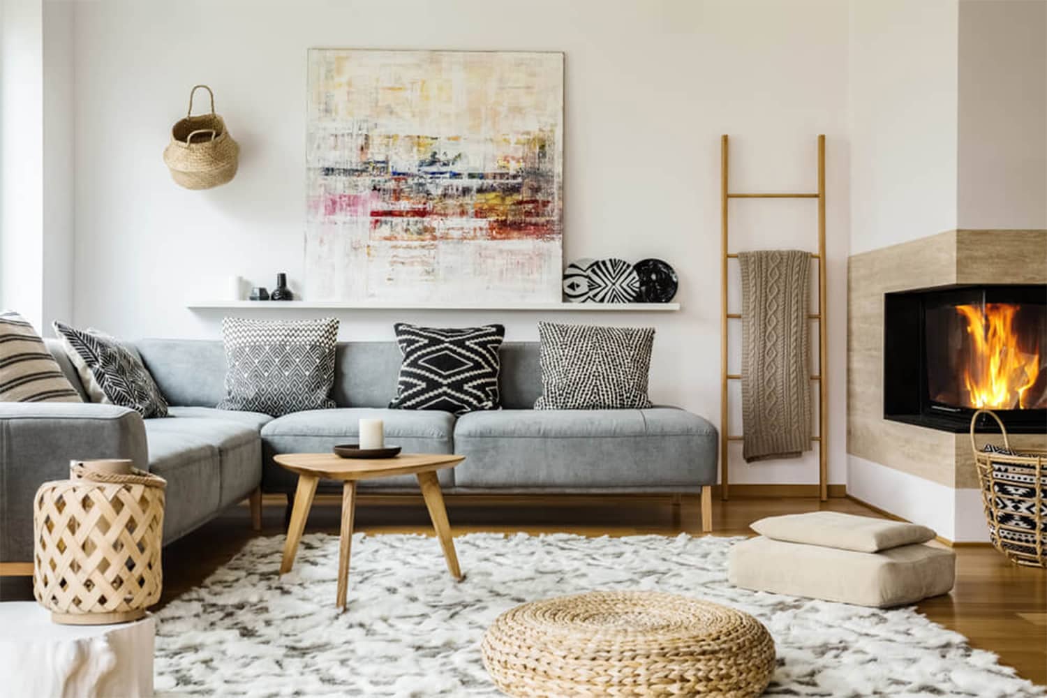
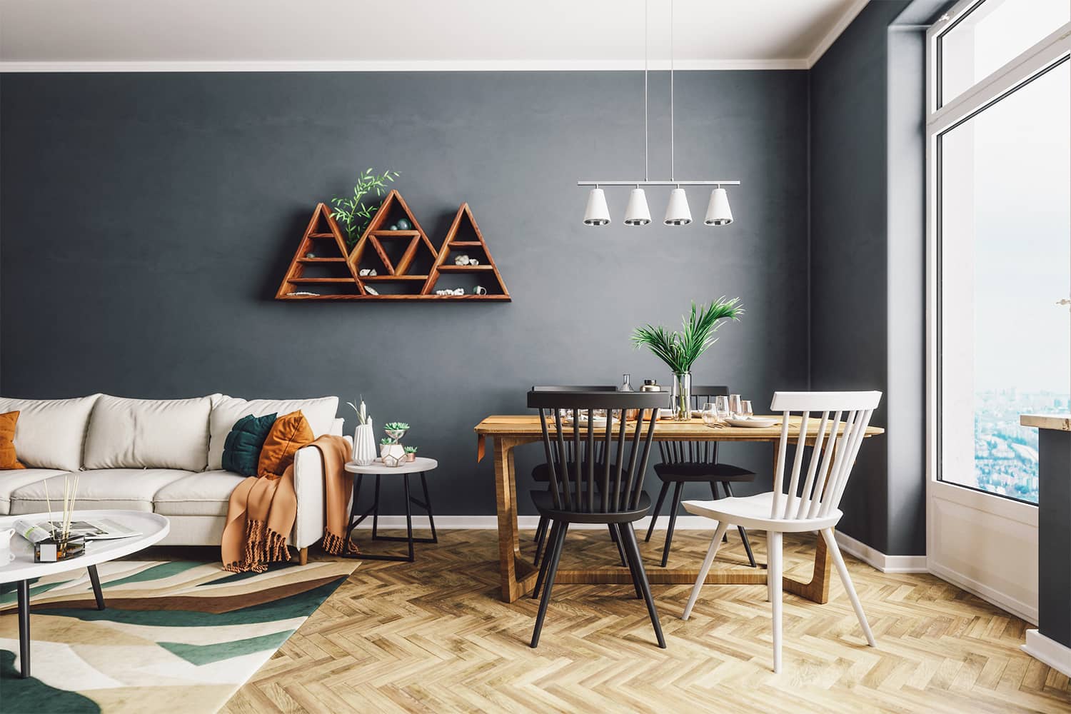
How to correctly use complementary colours in Interior Design.
The Layout
Natural Light
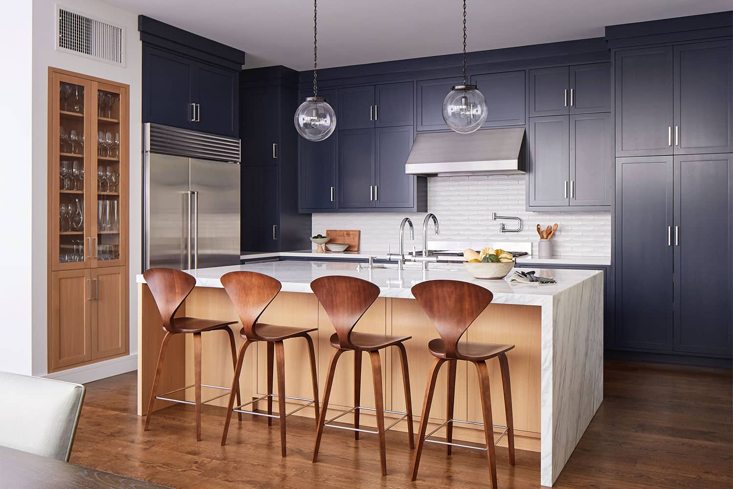
The room seems to be naturally well lit. But a niche can be identified between the cabinets on the left, which render it useless without any artificial lighting.
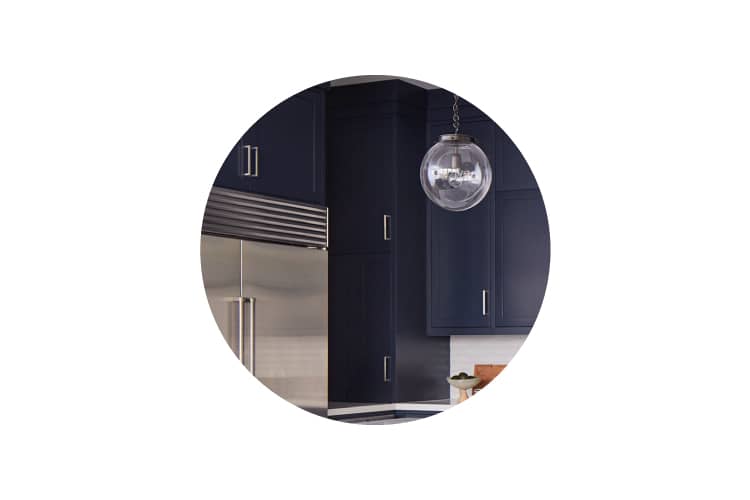
The poorly planned niche between the cabinetry.
Accessibility
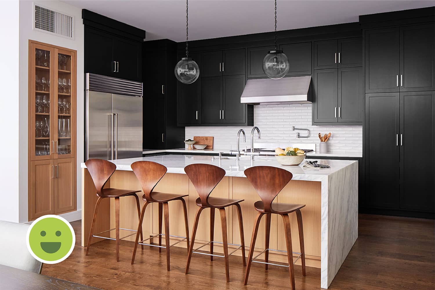
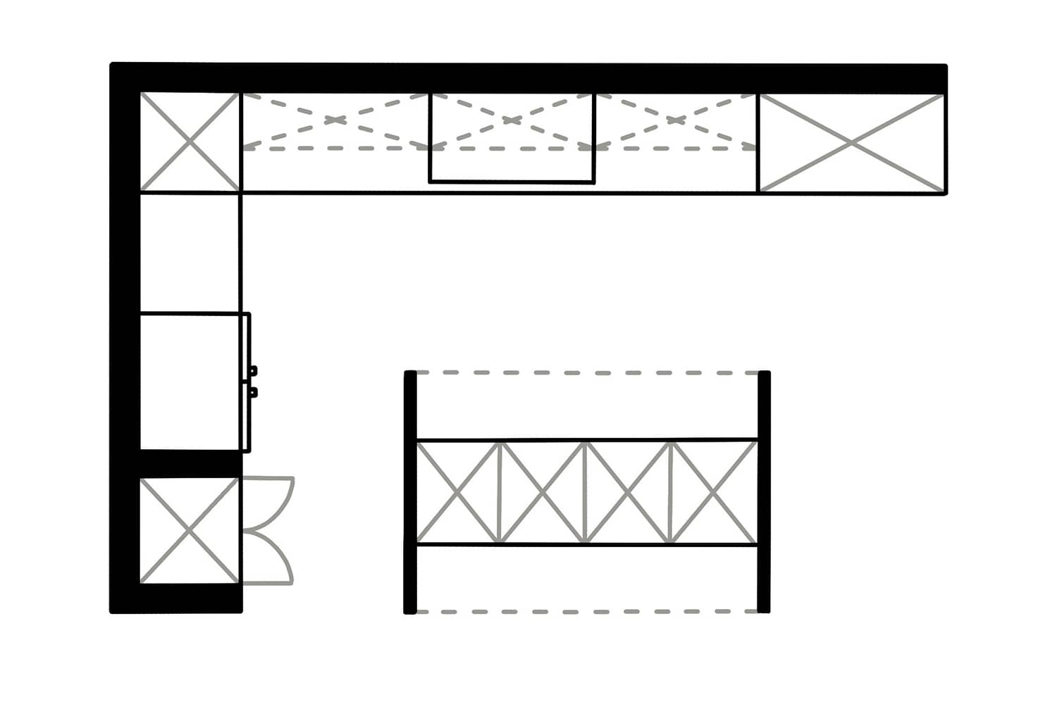
The open kitchen layout ensures easy access to the stove, refrigerator and sink, forming a functionality triangle between them. The cabinets higher up are not easily accessible and hence, should be employed only if necessary.
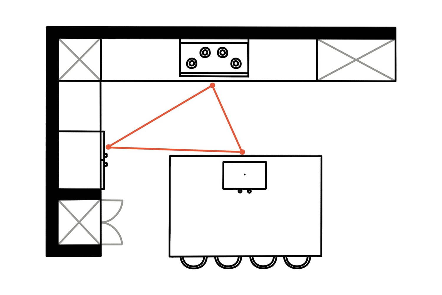
The three main appliances in any kitchen: the stove, fridge and the sink should be easily accessible as seen here.
The Counter
The counter space is much lesser than what it could be. For example, the left corner of the counter has a cabinet built on top of it, forming a niche which fragments the counter. The large island doubles up as a serving table which adds good functionality to the otherwise inefficient counter.
The Cabinetry
Given the ratio of the counter space and required storage the cabinetry seems too much. The cabinetry hides most of the kitchen appliances which is good planning.
Kitchen storage below the counter is always a bonus but when provided above, may eat up on precious counter space and hence, should be planned properly.
The Seating
People sitting on them will find it difficult to interact because they would not be facing each other. Hence, despite the four chairs adding great functionality to the kitchen island, the overall arrangement is inefficient.
The Background
Composition
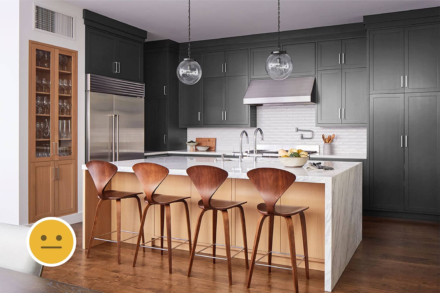
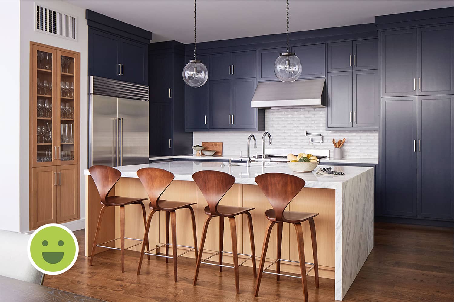
The cabinetry is the most prominent element in this image it forms the background despite being a part of furniture. Thus, it is also the biggest contributor to the use of colours in this space.
Colours
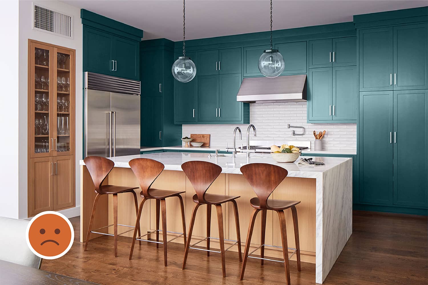
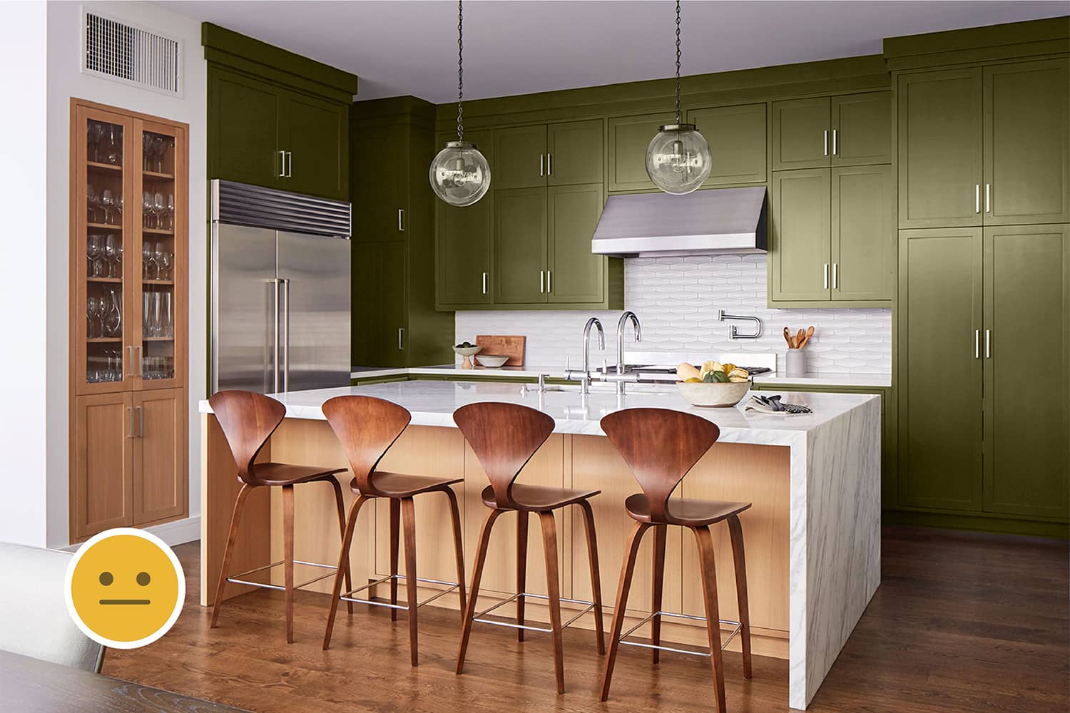
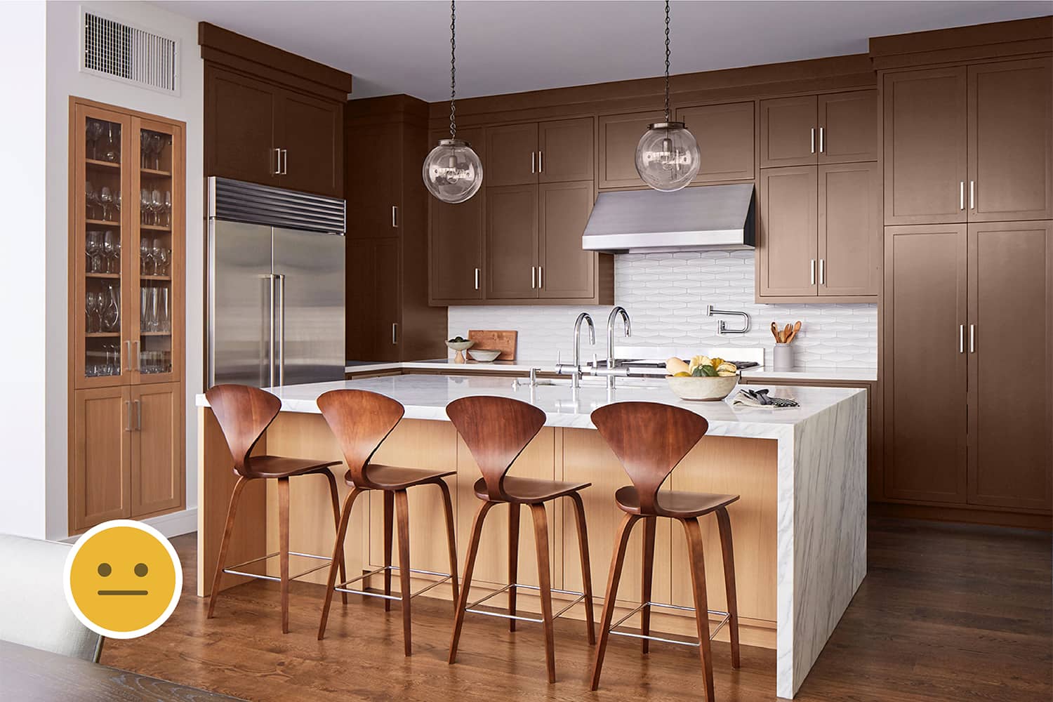
Being an open kitchen the flooring and the ceiling can’t be different just for this part of the house. Thus, the white ceiling and brown floorings can’t be changed and become the starting point for the interior design of the kitchen. It is good idea to use a complementary colour like dark blue. But using neutral colours like grey or black for the cabinetry is also another choice.
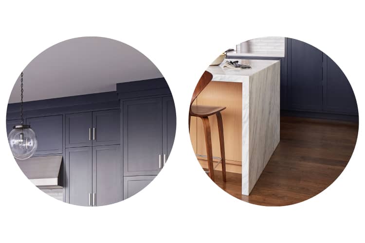
Left: The white ceiling & right: The brown flooring cannot be changed as they are common to the entire house.
Patterns & Textures
The stainless steel appliances add rich texture, unlike plastic. The metallic handles accentuate the cabinets well. The white ceramic tiles add a pattern to the backsplash, which is better than keeping it plain white.
The Foreground
Furniture
Shape & Size
The chairs introduce curves to the kitchen which otherwise is dominated by straight lines and sharp edges. There is no fixed rule to how the chairs should be shaped but the size should be a relief to the bulkiness of the kitchen-island and cabinetry, which is happening here.
Colours
The wooden chairs resonate with the flooring. The kitchen-island cladded with white marble contrasts well with the cabinetry. These three colours complement each other.

Complementary colours can make a space colourful and despite being placed diametrically opposite on the colour-wheel, they also look appealing together.
Details
The support to the right of the kitchen-island has a marble cladding while there is no cladding to the left. This Asymmetry in Design is not validated either by functionality or design style and hence, should be avoided.
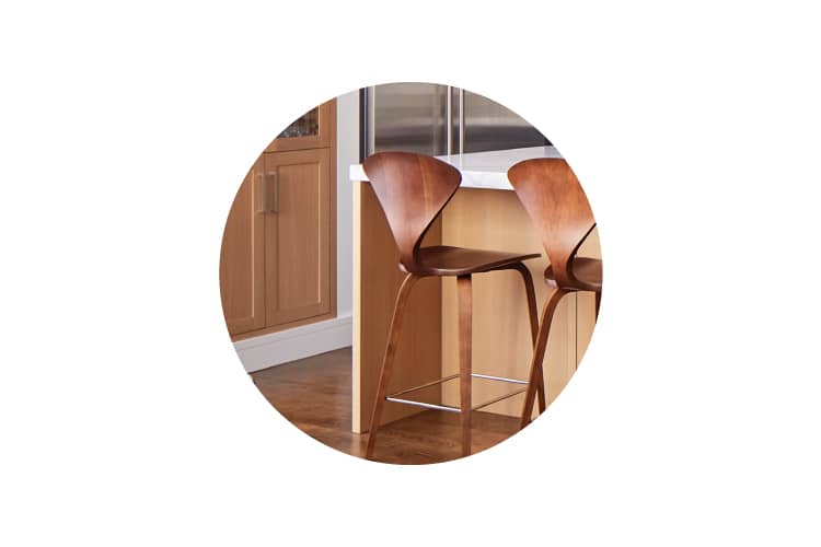
This asymmetry in the marble cladding could have been avoided as it neither adds to the functionality or aesthetic of the kitchen.
Decor
Textures
Almost everything in the kitchen is smooth and hard to touch. This is understandable since the kitchen is a functional space. But, incorporating softer textures would add variety and richness to the space. For example, using cushions over the chairs will make them more comfortable and also add soft texture.
Details
The edge of the cabinet panelling reveals its stepped profile which could have easily been finished well. Smaller details like these are vital to good Interior Design.
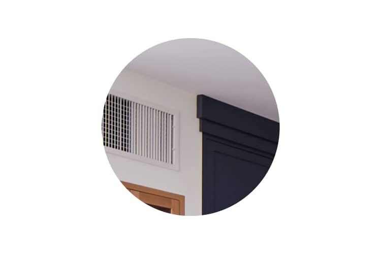
If the cabinet panelling were properly finished, this ugly profile could have been avoided.
Summary
Making a good kitchen layout
Kitchens are more about their function than look & feel and hence, its layout is vital. Using the kitchen should be easy, important appliances should be in proximity and there should be ample storage: all this being specific to the user's way of working.
Using complementary colours
To make a space colourful yet harmonious, complementary colours do well. But the important point to note here is that the colours used in one space should not conflict the colour palette in the rest of the house.

