www.shutterstock.com
Design Review 2
Things to Learn
How to create an intimate social space in your living room.
How to make a balanced choice of furniture given their function, shape and size.
How a room can look good by using just a few colours.
The Layout
Natural Light
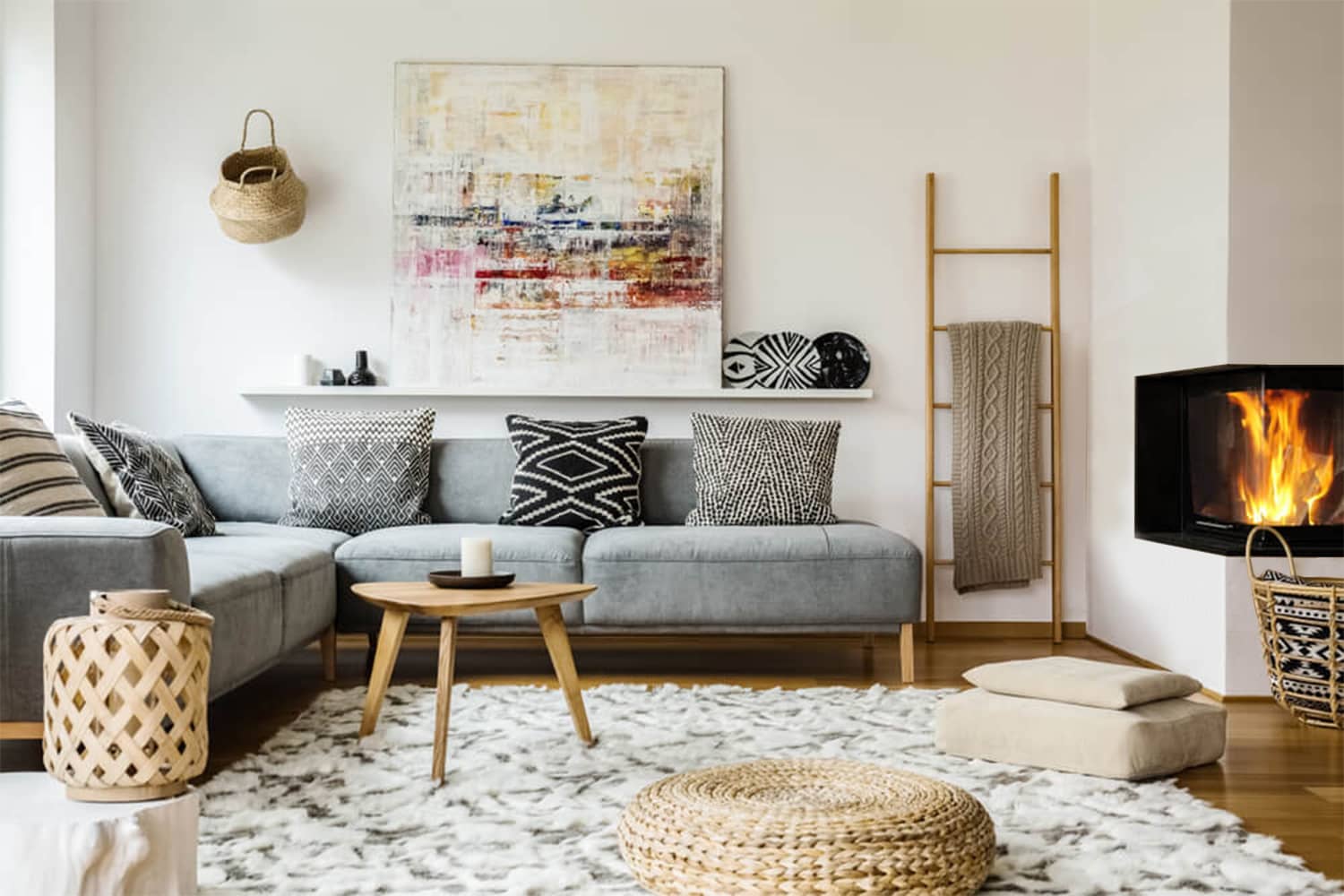
As this seems to be a cold region, the opening could be a much needed source of natural source of sunlight and heat.
Poor Ledge Positioning
The shelf behind the sofa is at a wrong position as anyone might hit their head on it, if they aren’t careful.
Creating a Social Space
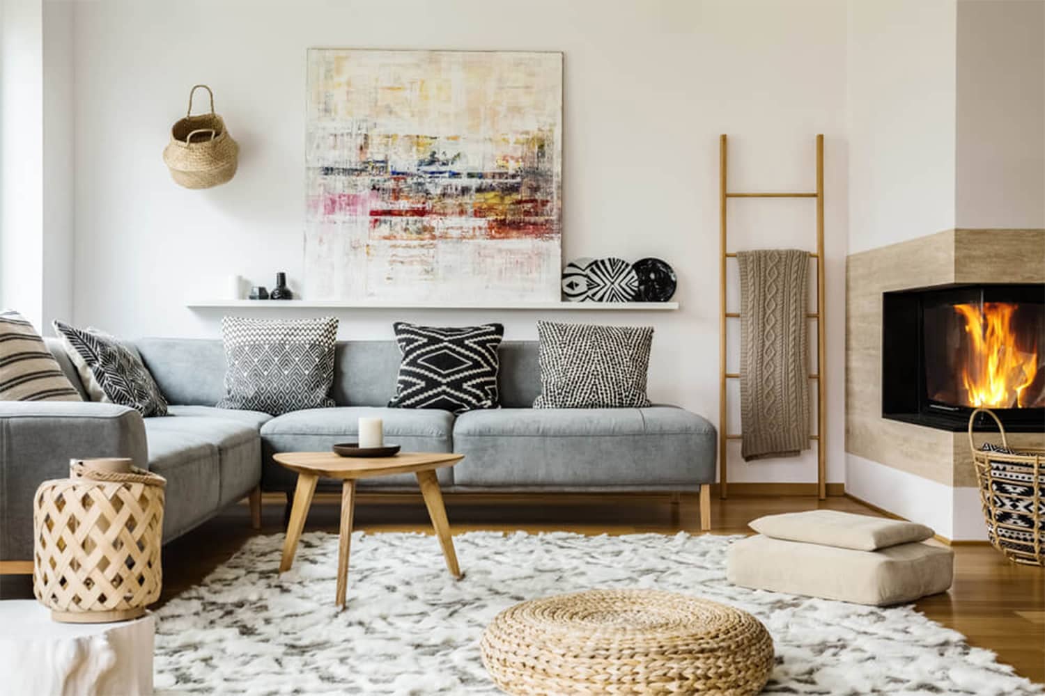
The L-shaped seating takes up the entire corner going around the fireplace with a small coffee table in the middle. The rug creates a comfortable space. The small table and the pouffes can easily be moved around to allow several people to sit next to the fireplace.
The layout creates an intimate social space.
The Background
Colours
White walls invite more light into the room and make it look larger. The brown polished wooden flooring gives a good contrast to the walls.
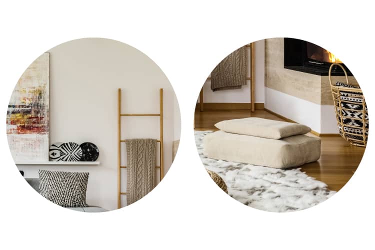
From left to right: Plain white wall; Polished wooden flooring.
Textures
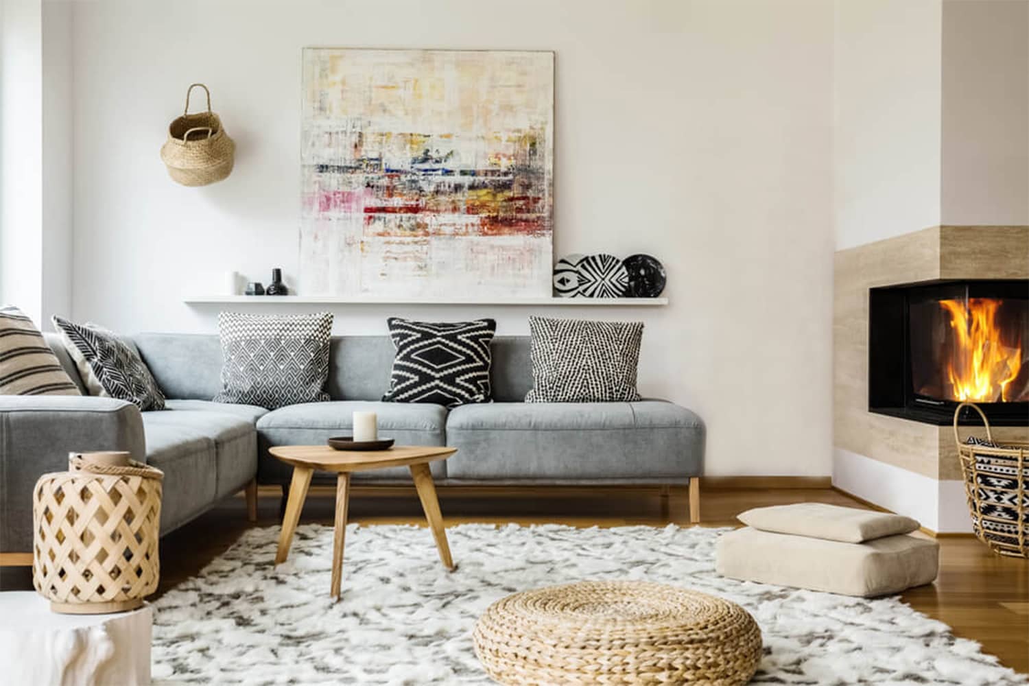
The earthen finish framing the fireplace adds visual contrast to the room which otherwise has white walls.

Details
For some reason the skirting at the bottom of the fireplace wall is shorter than the rest of the room. This detail breaks the rule of Consistency in Design and should be avoided unless necessary due to some functionality reasons.
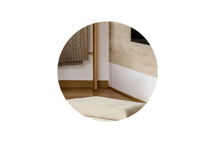
The change in the height of the skirting could be avoided to make it neater.
The Foreground
Furniture
Shape & Size
All pieces of furniture share a similar design style. The thin wooden legs of the sofa, along with the light weight coffee table and pouffes, make the space look more open.
Colours
The colour palette of the furniture has shades of beige and grey. The wood of all the furniture is of the same shade and thus, consistent.
A Smart Choice
This is something we might never notice. If there weren’t a shawl-hanger, the corner would have looked empty. Naturally we would be inclined to fill that space with either a planter or a side-table. But, the shawl hanger occupies almost no space in the layout, adds functionality and also adds to the décor of the room. Hence, a smart choice.

Decor
Object Placement
The rug frames the seating next to the fireplace. The basket hung asymmetrically on the wall takes away attention as it is creating contrast due to its darker shade. The basket is not the right object to be used here.
Colours
The colour of the cushions are shades of grey and thus go well with the sofa. The painting on the mantel is the only décor that adds highlights of colours different from the colour palette.
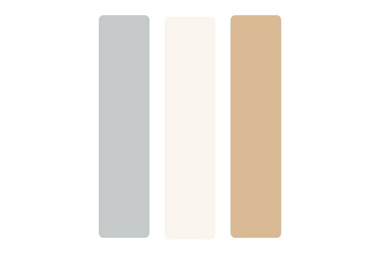
The consistent colour palette of this living room uses only shades of beige and grey.
Patterns
There are classic patterns of stripes and weaves that are present throughout the décor. Using similar patterns enforces neatness into the room.
Textures
The rug could have a texture to match that of the sofa but here, a soft hairy one is used. Unlike any texture in the room, this may look odd but it is a good addition keeping in mind the cold against which the rug adds the much needed warmth.
Summary
Creating an intimate social space
To enable interaction, a room does not require furniture; seating can be added even on a rug, platform or even on the floor. Here, the rug between the fireplace and sofa frames this warm social space while comforting from the cold floor.
Using furniture of simlar design style
In anything, Harmony is a must, although achieving it need not always require a similar design style. But, it is undoubtedly the easiest and the safest means to do so. Here, the furniture demonstrates the use of similar styles.
Using few colours
A room need not have many colours to look good. Just using a few colours can yield a good result. The important factor is to ensure that the palette is not dull. For example, the cool grey colour provides relief from the warm tones of beige and brown in this image.


