www.interiordesignpantry.com
Design Review 1
Things to Learn
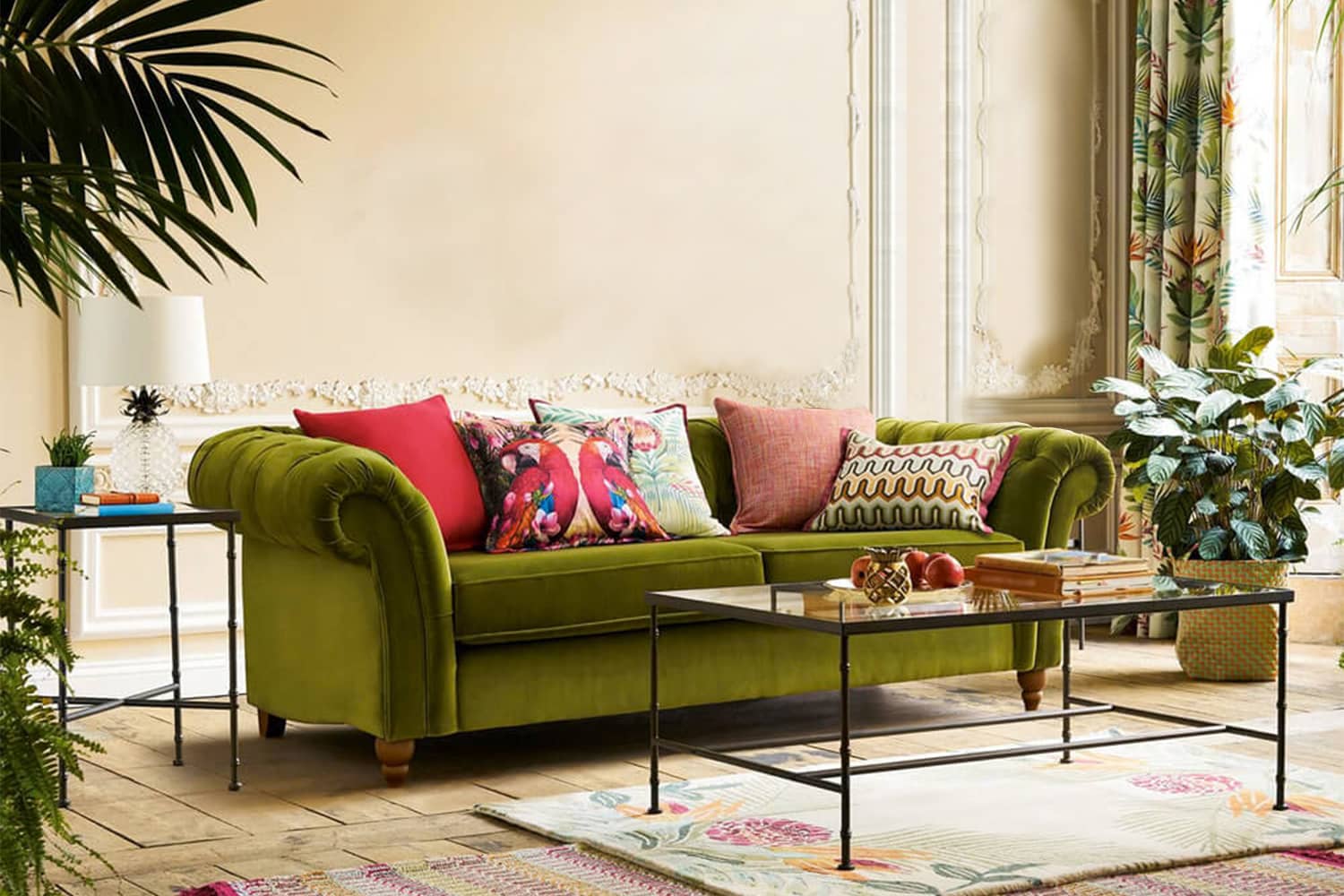
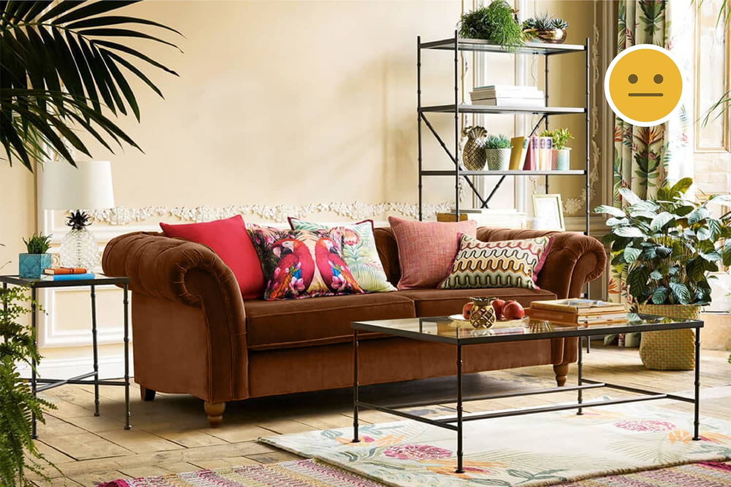
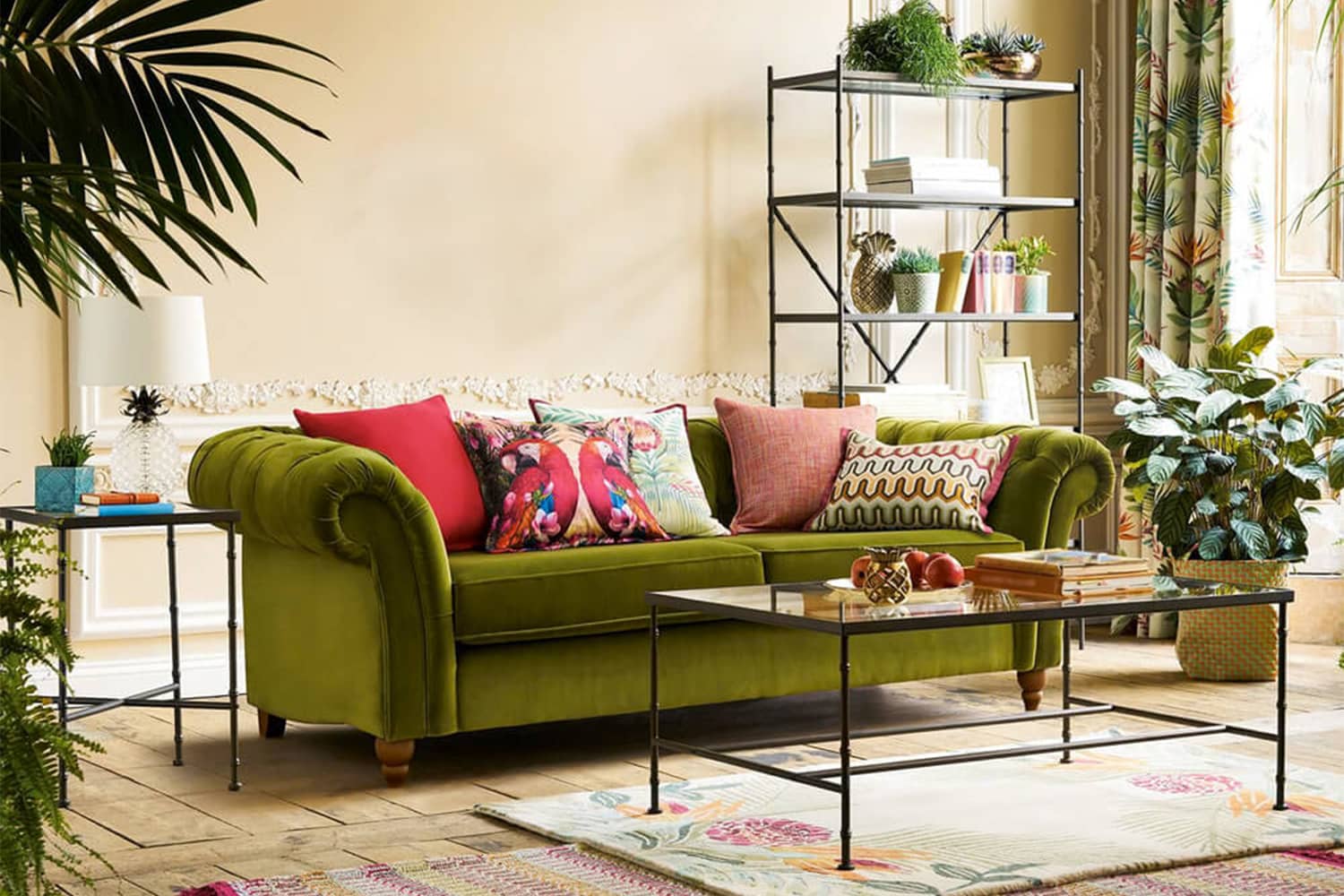
How this couch makes a beautiful focal point in the room.
Why this living room creates a warm ambience.
How to break the unwritten rules of Interior Design by using colours and patterns that contrast heavily with the setting.
The Layout
Natural Light
Natural light is essential to make the room as lively as it is. The furniture is not blocking the source which is a good thing.
Focal Point
There is an attempt to make the seating the center of attention by placing only one couch and no other seats around it.
Clutter
Just looking at this image, it is unclear why there is a storage rack behind the couch. The room would have looked neater without it.

The Background
Colours
Lighter colours make the space look larger and also allow for more colour options for the foreground. Here, the tint of yellow in the background will affect majorly what colours in the foreground should be used.
Textures
The decorative relief creates a beautiful inner-border to the wall which adds a hint of classical design style to the room. The flooring adds the much needed natural wood texture.
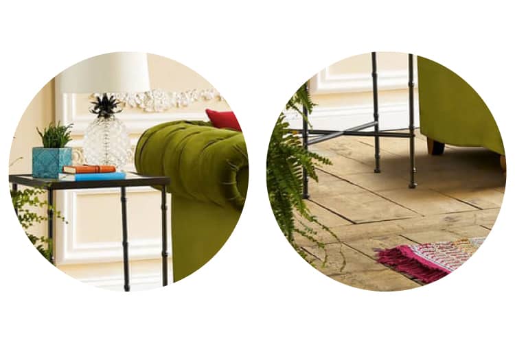
From left to right: Classical decorative relief on the wall; Natural wooden flooring.
The Foreground
Furniture
Shape & Size
The couch is very bulky while the tables around it are thin and light-weight. This volumetric contrast further enhances the focal point. The design style of the couch also resonates well with the classical decorative relief on the wall. A very modern couch might have looked odd here.
Colours
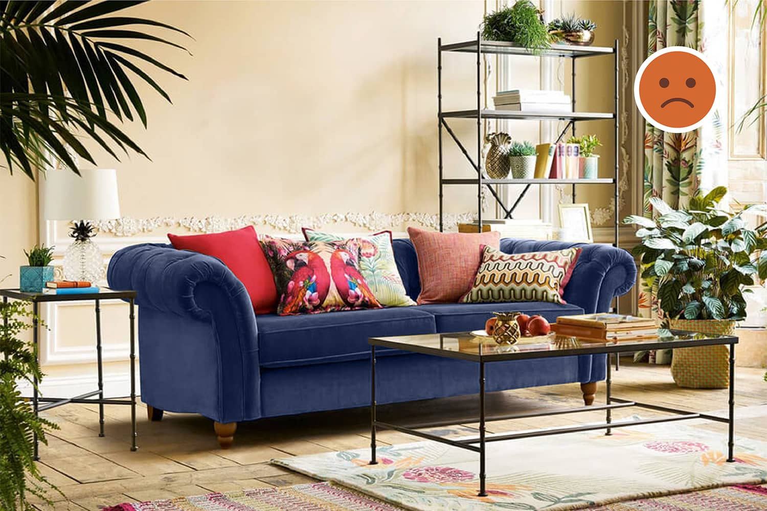
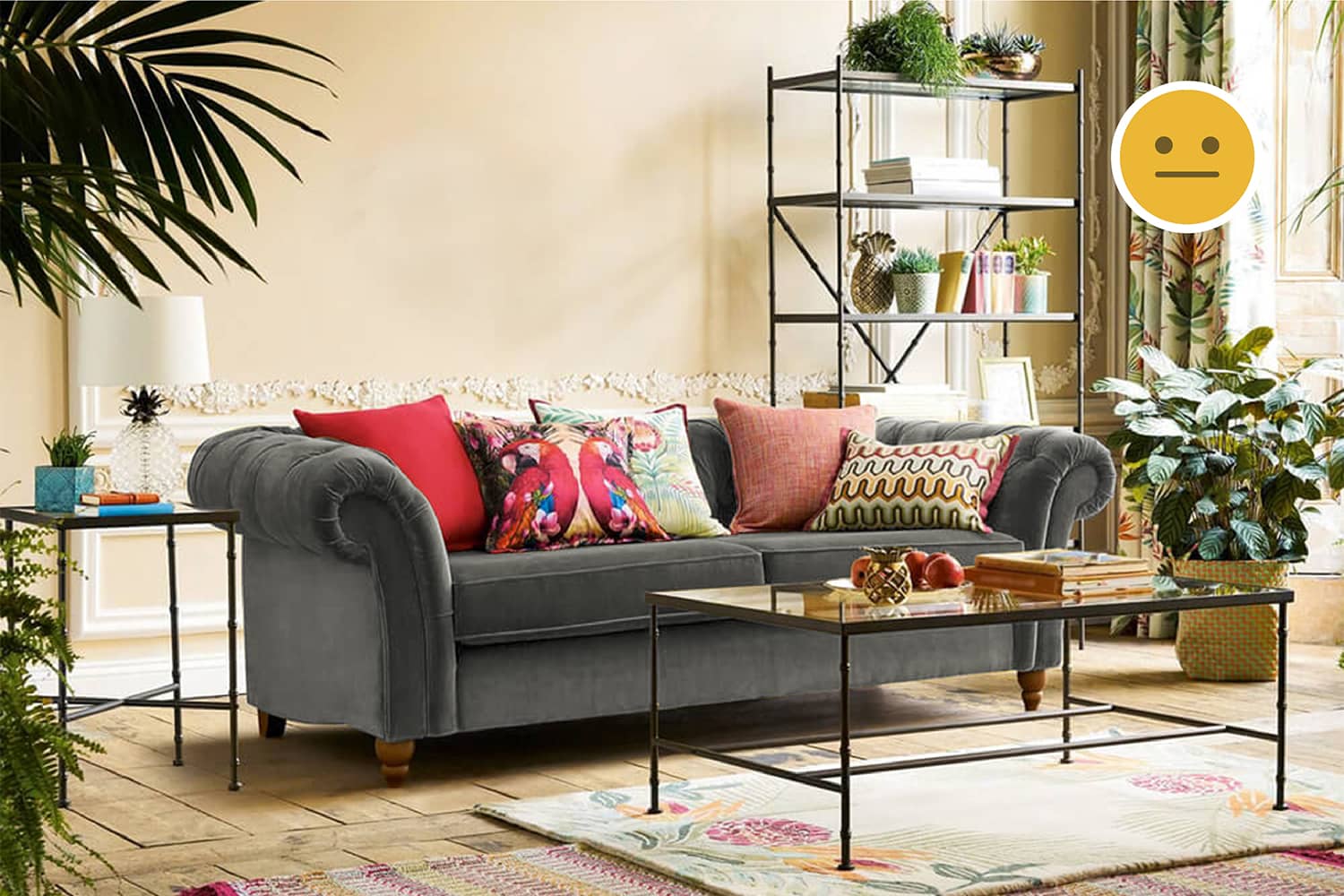
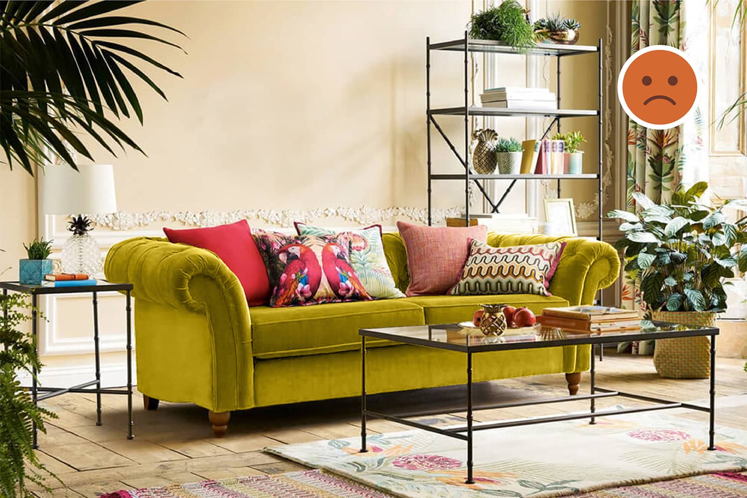
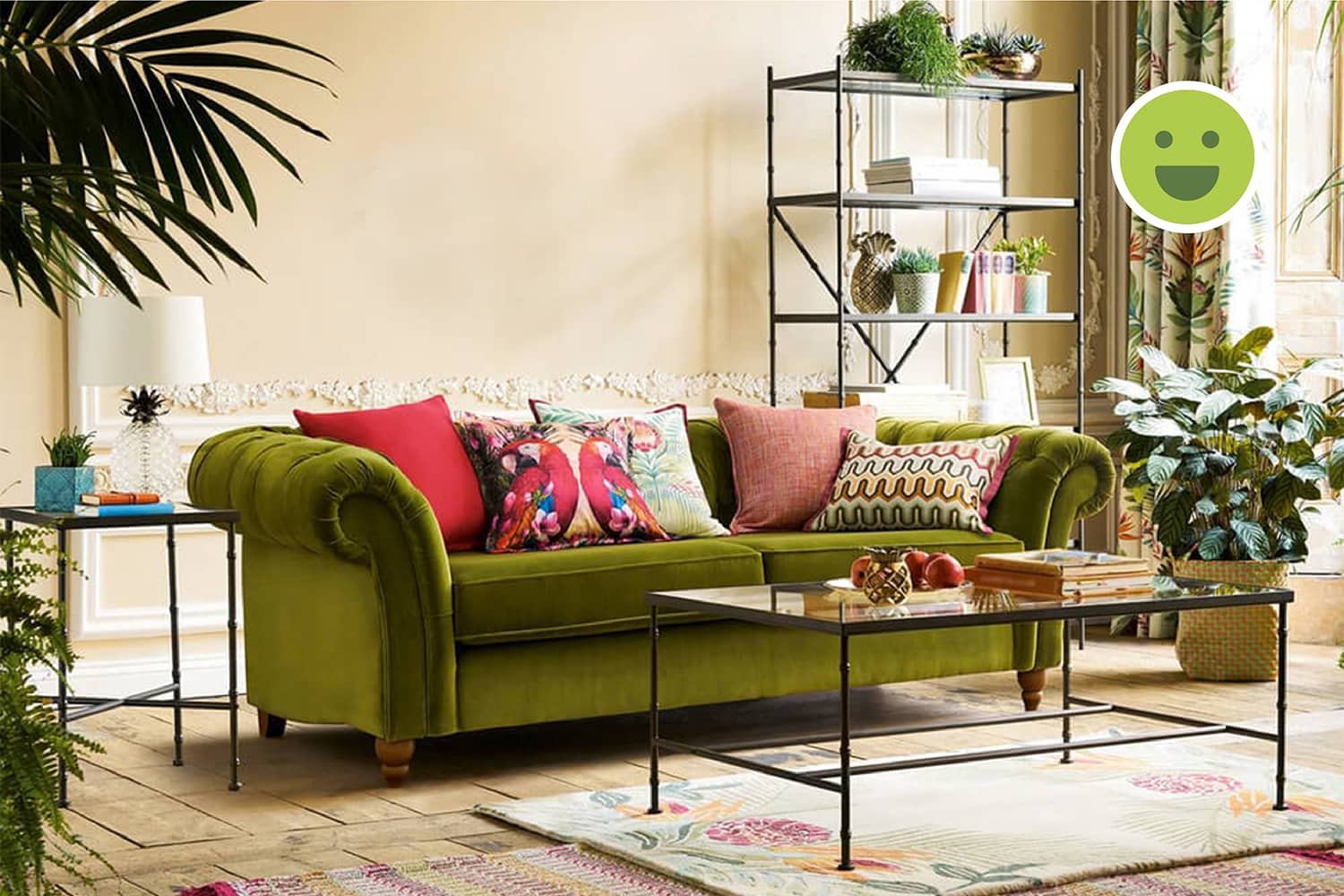
The yellowish-green couch stands out very well in front of the background which has a yellow tint in it. This is a very good example of how a darker shade of analogous colours can create a beautiful visual contrast.
Textures
The couch has a green velvet texture, while the minimal tables and rack have a hard steel finish. These textures create a tactile contrast with the materials used on the background surfaces.
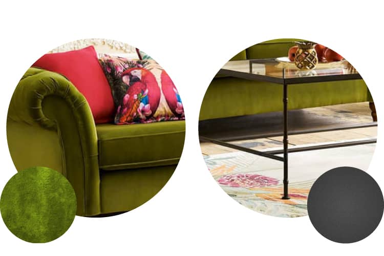
From left to right: The green velvet texture on the couch; The hard steel finish on the tables.
Decor
Object Placement
The indoor plants complement the furniture layout and add life to the room. Other objects such as cushions, items on the tables and rack are a personal choice. The table lamp can create a cozy corner on the couch at night.
Colours
The décor allows for the introduction of more colours into the room to liven it up. For example, the red cushions on the green sofa add a pop to the whole setting.
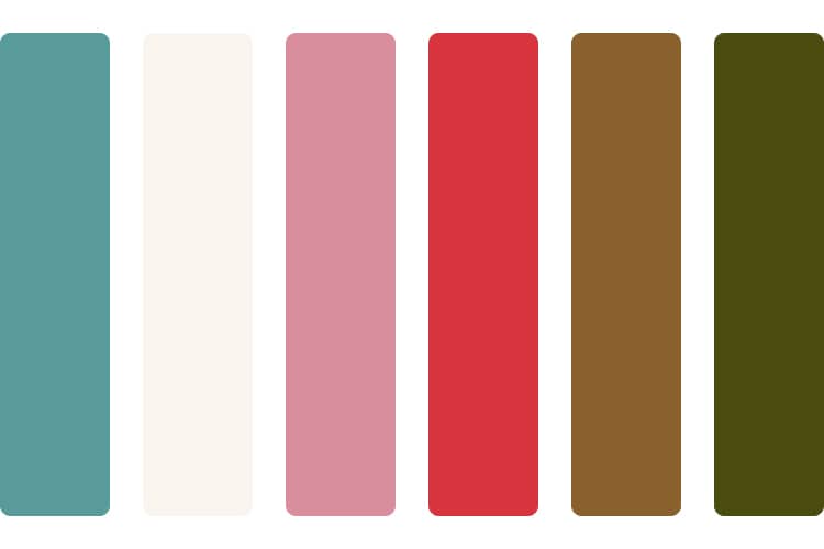
The colour palette of the decor adds several shades not present in the rest of the design.
Patterns
The floral pattern on the curtains go well with the ambience of the room. The cushions although colourful have different patterns, especially the one with the birds on it and break an unwritten rule of Consistency in Design. Despite this, the harmony in the design is unbroken and a personal touch is added.
Textures
The rugs provide for a welcoming space around the seating. This again adds to warmth in the room. Although just one rug is enough, here we can see a soft one above a rough rug to add tactile contrast.
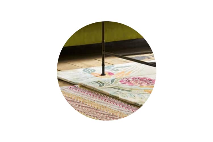
The variation in the texture of the rugs adds richness to the interior design.
Summary
Creating a focal point
Focal points are all about contrasts: volumetric, visual or tactile. But, it is important to ensure that the object of focus should not be too different from the design language used.
Creating an ambience
Most people on seeing this image will think of this space being near the sea on a late morning during the summers. This is because most of us have experienced this before.
For example, we credit summers more with flora than winters, beaches with bright light than mountains, etc. Creating an ambience is about subscribing to an experience you wish to relive.
Breaking design rules
Here, we saw how a completely contrasting colour palette was introduced in the decor. An important factor why it worked well is that this contrast is in line with what we would expect in a setting which the ambience of this space is replicating.
For example, bright red, birds, plants all are in line with what we expect summers to unfold. Hence, their existence does not contradict the design intent. But, their inclusion is personal and hence, subjective.


