www.dacor.com
Design Review 9
Things to Learn
How to create a flawless space.
How to use false-ceilings correctly.
The Layout
Light
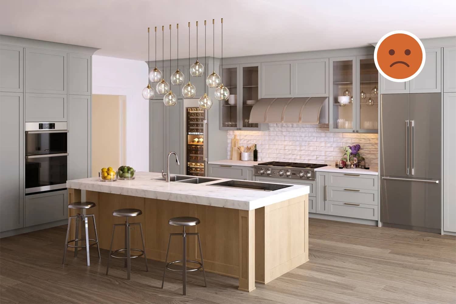
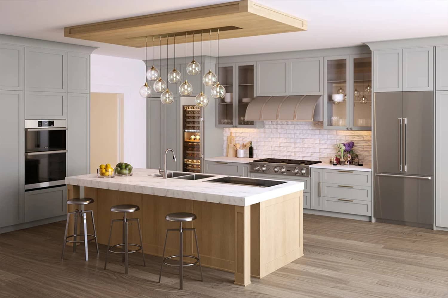
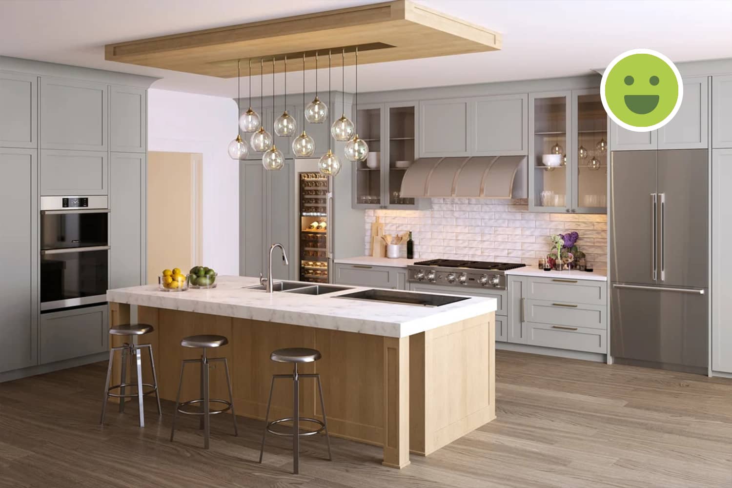
There must be a large opening to the right of the kitchen out of view from this image as the natural light in this space is abundant. The cabinetry has LED strips for task lighting and suspended lights over the kitchen island for ambient lighting.
Accessibility
The passages around the counters are comfortably wide. This also depends on the layout of the rest of the house. Also, the stove, refrigerator and sink, form a functionality triangle between them.
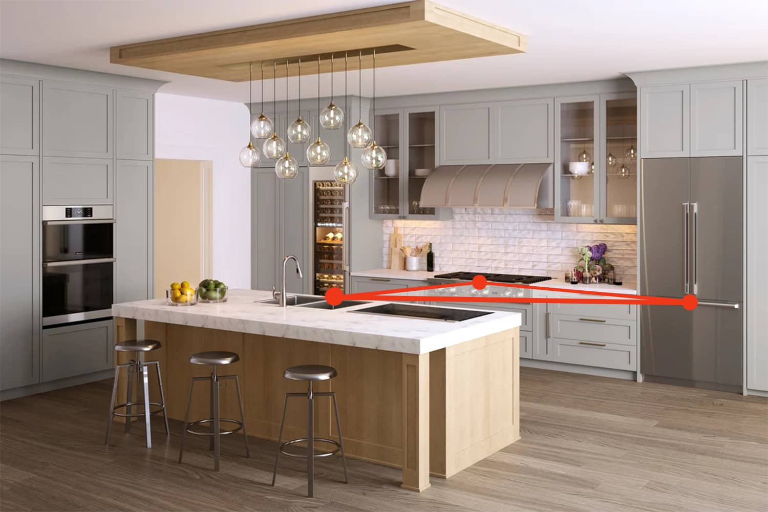
The three main appliances in any kitchen: the stove, fridge and the sink should be easily accessible as seen here.
Counters
The counter space may seem less given the size of the kitchen, but this is purely user-centric. The wide kitchen island in the center can be used as a breakfast table and helps position the sink appropriately to form the functionality triangle mentioned above.
The Background
Composition
The cabinetry is placed symmetrically on either side of the counter while the kitchen island in placed just opposite to the counter to maintain symmetry. In addition to this, the island with the false-ceiling on top also forms a well-defined space by itself.
Being isolated by passages from the kitchen area, the island becomes a distinct zone by itself within the kitchen space. This is emphasized by the false-ceiling over the island that is similar in layout and style as the island cabinetry.
Colours
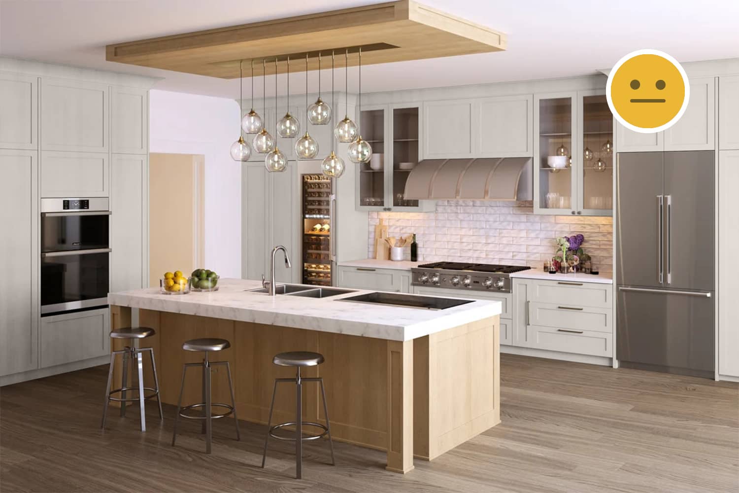
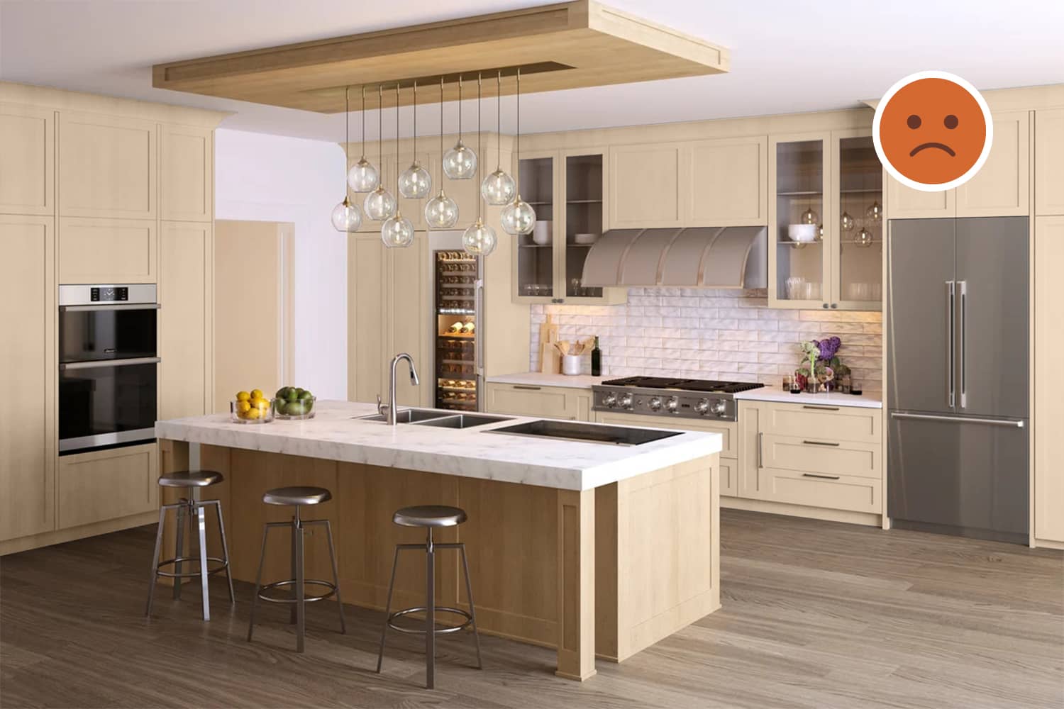
The cabinetry constitutes a large surface in this image. Hence, using suitable colours on this surface is most important. Here, we see a neutral grey with a cool tint that contrasts well with the white ceiling and also the brown flooring.
The Foreground
Furniture
Colours and Textures
The appliances, chairs and also the plumbing fixtures employ a stainless-steel finish as an accent colour. The counter-top of the kitchen island is similar to the one in the background: both made in marble. while the cabinetry under the island and the false-ceiling both have a light-brown wooden finish.
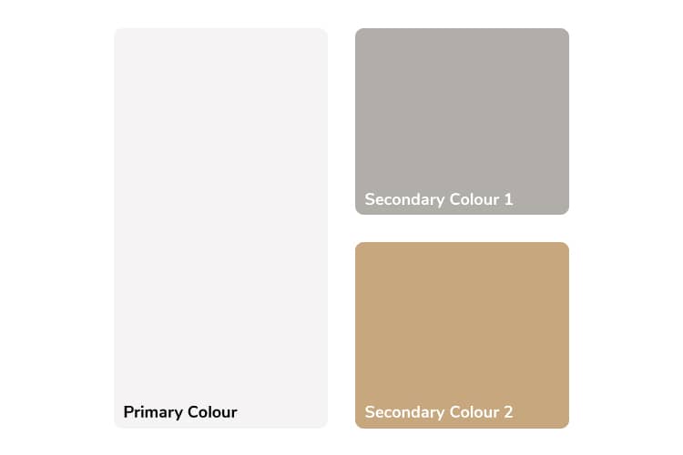
The colour palette of the entire space consists of a range of light colours: cool gray, neutral white and warm light-brown, which help balance the colour palette.
Details
The background cabinetry curves toward the top when meeting the ceiling while the false-ceiling above the kitchen island is rectangular throughout. Also, the background cabinetry offsets a bit inside when it meets the flooring while the island cabinetry does not. The counter-top under the HOB is thinner than the one on the island. This decision is correctly based on the style of the respective cabinetry and not on making both identical.
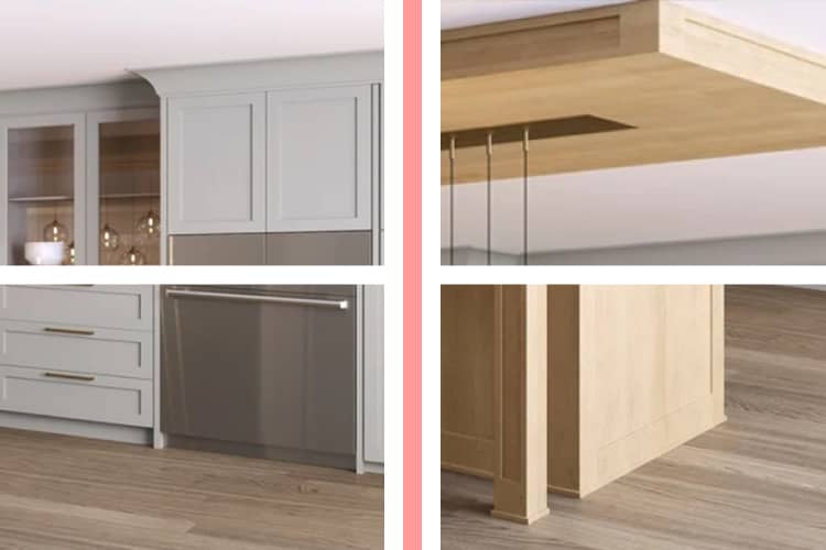
Left to right: The details of the background cabinetry against the kitchen island cabinetry at the ceiling and flooring levels respectively.
Design Style
The cabinetry of the island and the rest of the kitchen are different yet share similar aspects of design. It is important to note that no argument can be made for or against the this choice as it could be derived from the interiors of the space adjacent to the kitchen or also from the architecture style of the house. The important aspect is how variation can be created while maintaining consistency in style.
Decor
False-ceiling over the island
The false-ceiling with light-brown wooden finish over the kitchen island zone acts as the base to the suspended lights and adds colour-contrast against the white ceiling. This is purely aesthetic in nature and demonstrates a good method to create objects of interest when deemed fit. The suspended lights have metal accents on their ends and strings which is the accent colour. Also, the lighting fixtures are transparent and thus, do not impact the colour palette in this space.

Summary
Creating a Flawless Space
Ensuring a space is designed well rests more on which decisions are not to be made. Here, we see a similar deductive reasoning. The colours have been used keeping in mind the space it is adjacent to, the cabinets share similar yet distinct design styles and colour accents have also been been used appropriately. It is important to note that most if decisions are made to avoid over-designing: adding more colours or design elements just for styling.
Using False-ceilings correctly
False-ceilings must be used as a tool to demarcate distinct zones or spaces. Here, the false ceiling is about the same size as the counter below and also follows the design style of the kitchen island cabinetry. As an element by itself, it becomes part of the island and becomes an object of interest without violating any design principles. Instead, it subtly emphasizes the distinction of the island as a zone within the larger kitchen space.


